Comic Art

A Good Art Year

2010  has been a good year for art.

I refer to ‘comic art’ by the way, not art as in music or drama or art art, if you know what I mean. To be even more specific, I refer to my small collection of comic art,  something which has taken up quite a bit of my daily life. Hello, I am a Comic Art Addict and proud of it.

At the beginning of last year, I was fairly convinced that there was one great piece that I would buy. It was a page that I saw when I was in LA towards the end of 2009, in a friend’s collection. I was at his place, and he had just finished showing me the pieces on his wall, and then remembered a bunch of stuff that had just been framed but were not up on the wall yet. It was a page from one of my favorite comics, Neil Gaiman’s Sandman.

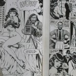
A brief word on the art of Sandman – in course of its 75 issues, the series had a tremendous line-up of artists, some extraordinary. most of them good, a few pretty middling. In most cases, the bad printing process on the series – remember that this was the late 80s/early 90s, where comics were just beginning to get used to computer coloring, and the quality of the paper, while not the cheap newsprint quality ‘mondo’ format from the 60s and 70s, was still far from the glossy format you young punks are familiar with today. So some of the printed art came out muddy and ugly, which ruined some of the artwork. Especially the work of Mike Dringenberg. Dringenberg was co-creator of the Gaiman run on Sandman, he inked Sam Kieth’s work in the early issues, and when Kieth moved on by the end of the first arc, Dringenberg took over the pencilling duties, along with inker Malcolm Jones III. Because of the aforementioned quality issues, I never really appreciated Dringenberg’s work all that much – and was glad when Kelley Jones, who was to become one of the all-time great Batman artists by the early 90s, took over the acclaimed Season of Mists arc. Dringenberg pencilled the first and last issues of Season of Mists, and that’s it. He moved on from comics work, apparently, going on to illustrate children’s books and album covers.

The first chapter of Season of Mists, issue 21, was the first in which six of the seven Endless make their appearance. So far, readers had seen Dream and his sister Death, and there were hints dropped by the writer about the fact that those two might have other siblings. The introductory sequence in that chapter had an interlude of sorts, where Gaiman wrote brief essays about the six Endless, choosing to omit the Prodigal (we are to find out later that it’s Destruction, who abdicates his position). Desire and Despair on one page, then Destiny and Delirium, and finally Dream and Death.

This last ‘interlude’ page was the one my friend owned.

I had to sit down. Because the art was so brilliant, so delicate and otherworldly that it made my knees weak. The expression on Death’s face, the bubbly water-color shadow that Dream cast behind him (later, when I held the page in my hands, free from the framing glass, I saw that Dringenberg had used glossier paper pasted on the bristol board – probably to enhance the watercolor effect), and the overall  My friend had asked me a few weeks ago about which page from his collection I liked the most, and I had, without hesitation, mentioned one that had struck my fancy. At the moment I saw the Sandman #21 page, I changed my mind, and I told him so. He smiled, and said that if he was ever going to sell this page, I could buy it from him at the price he had originally bought it for. Which was a lot, obviously. But yup, if there was ever a gotta-get-this-or-I-shall-regret-this-forever moment for me, it was when I saw this page. So I agreed.

A lot of collectors do not like artwork that has been personalized to other people. This page has both Gaiman and Dringenberg addressing someone named ‘Jordan’. Gaiman has the words ‘First you dream, then you die’ scrawled before his signature, while the artist just let his art do the talking, and says ‘For Jordan’. I do not mind. Jordan, whoever you are, thank you for keeping this page in  your collection and selling it to the right person who sold it to another right person.

Because 12 months later, I am the owner of the page.

It took some careful budget management, and much brain-ache. In the meantime, I prepared myself mentally – I know it sounds pompous saying it aloud ( hah! Like the rest of the post doesn’t) but really, wrapping my head around the idea of owning it needed a bit of …self-conditioning. Reread Sandman again, and enjoyed myself thoroughly. Read Hy Bender’s Sandman Companion, which gave me much deeper insight into the series, as I discovered things about it that I had not realized, or aspects of the story that I had overlooked. (I heartily recommend that you read The Sandman Companion, if you are a fan) And yes, I felt really bad for Mike Dringenberg, because his artwork, even in the Sandman Absolute Edition had taken a beating thanks to the limitations of printing technology. Or probably because the printer was high – the printed page made the blacks of the original pink – PINK! – because the text had to be given prominence.

Obviously that was not the only page I got this year. I mean, I do have self-control and all, but  the best-laid plans of mice and men….

But that, as they say, is another story altogether.

Standard
Comic Art, Comics

Collectible-lust: The Rocketeer Artist’s Edition

To people familiar with the independent comics boom of the eighties, the name ‘Dave Stevens’ is synonymous with dazzling artistry. Stevens’s most famous creation is The Rocketeer, a throwback to the pulp movie serials of the 1940s. Fans and industry professionals alike swooned over his lush yet delicate brushwork, the seemingly effortless way his storytelling not only paid homage to the past, but created something that was unique and contemporary, a heady mix of cheesecake nostalgia and crackling adventure. Even though Stevens never managed to complete the story he had started – the reasons being a mix of delays caused by his painstaking perfectionism, his professional commitments outside the comics industry and in the later stages of his life, a battle with cancer – his limited body of work includes a number of comic covers and movie production art. A cover drawn by Dave Stevens, regardless of who wrote or drew the content within, or the quality of the comic itself, would sell extremely well, people cherishing the chance to view another example of this man’s sublime talent.

I became familiar with Stevens’ work through ad inserts for The Rocketeer in other Pacific comics that I bought in the mid-eighties. Getting issues of Pacific Comics Presents (the comic in which the character appeared for the first time) was tough – I didn’t manage it until 2007, when I found copies in a comic-shop sale in Mountain View, for 50 cents each. But the funny thing that I realized later was that I had seen Stevens’ work a long time before I heard of the Rocketeer. This image, in particular.

Yaaaaaa! Sheenaaaaaaa!

This is one of Stevens’ most iconic works, and was used without credits or permissions to grace a 3-D comic called Jungle Ki Rani published by Diamond Comics. Diamond Comics ( not to be confused with Diamond Distributors)  is an Indian company that started off publishing Chacha Chowdhury, Pinki, Billu and Tauji – somewhere down the line, some of its titles became thinly Indianized versions ripped off from American comics. Some issues of Mahabali Shaka were panel-by-panel copies of Phantom and Tarzan stories from the sixties, a title called Chimpu had a story that was a shameless remix of Tintin and the Black Island and Tintin in America. And anyway, Jungle Ki Rani. Don’t believe me?

Sheesh...

And hell, I loved this image. I think I even wanted to buy a copy just for the cover, but my father got me something else instead probably because it was too risque.I finally read the complete Rocketeer on scans, sometime around 2004-2005. I was not so impressed, probably because I had outgrown the swashbuckling men’s adventure genre by that time. No doubt I would have been completely in love with it had I read it 10 years ago, but it felt a little dated, a little too innocent.

Stevens passed away in 2008. In late 2009, IDW Publishing released a collection of the complete Rocketeer stories, recolored by award-winning colorist Laura Martin (Planetary, Astonishing X-Men). This was the first time all of Stevens’ Rocketeer work – published over 13 years by different comic companies, including Pacific comics, Eclipse and Dark Horse – was collected in one volume. I was in LA during the release party of the book, but it was a weekday evening and Golden Apple Comics, the store where the party was being held, was on the other end of the city. Apart from the standard paperback, there was also a deluxe hardcover edition, with 100+ pages of bonus material, including unpublished sketches, script excerpts and original art scans, limited to 3000 copies, all  of which sold out in a matter of weeks.

But editor Scott Dunbier – a Stevens fan and an avid art collector – had more plans in mind. Comic art aficionados love Stevens’ work; the few pages that the artist sold are in offer-proof collections, most still reside with his estate. Dunbier came up with the idea of an Artist’s Edition of the Rocketeer, aimed at the same art-collecting crowd that paid extra money to get an insight into Stevens’ creative process by buying the Deluxe edition. One could argue that this was like finding excuses to make money off the same body of work, but then again, the end product was a complete labor of love. Dunbier, before he left DC/Wildstorm and joined IDW, was the guy who came up with the idea behind DC’s Absolute Editions, oversized, special-feature-laden archival hard-cover versions of series like Planetary, Watchmen, Sandman, and The Dark Knight. To call him a marketing genius would be selling him short – the man knows his shit inside out. He sold art to Graham Nash and Stephen Stills, for god’s sake!

The idea behind The Rocketeer Artist’s Edition was this – every page was scanned directly from Stevens’ artwork, at the same size as the original pages, making the book a super-sized 12 by 17 inch item. Some people said that Stevens the perfectionist would not probably like the flaws in his work to be laid bare. But there was no denying the fact that if there was an artist who deserved a release like this, it was probably Dave Stevens. And for a comic collector who does not have the means to own one of Stevens’ original pages, this is a brilliant way to pore through the intricacies of a master draftsman’s sequential art. The idea is not original – there have been similar projects in France, where legendary artist Franquin’s Spirou books received a similar treatment, but it’s a novelty for the American market. It was also a gamble for the fledgling company, because comic fans are notorious for not putting their money where their mouth is.  1200 copies were printed, and Dunbier talked about it on forums and comic sites, noting that the experiment would also be a worthwhile way to find out if other books could get a similar treatment as well, if this one sold well.  And boy oh boy, it sure did. The release at Comic-Con this year saw a large percentage of the books sell even at the hefty price-tag of 100$, while a glowing forum message by inker Scott Williams ensured that the remaining stock sold out by the end of the next week. I was in two minds about buying a copy for myself, I was on a book-buying hiatus, and shipping charges to India would bring the price to 150$. But it was Williams’ message, and the fact that Madhav was in the US at that time that helped me make up my mind. I think I probably picked up one of the last few copies from the site.

The binding on the book is surprisingly sturdy. Each page is printed on high-quality paper. The pages still contain pencil markings, splashes of white-out where the artist corrected aspects that he did not like. Yes, they are in black-and-white. But even an art-luddite would be awed by the magnificence.

Some pictures:

Though the book is technically out-of-print at the IDW website, you can still get copies, though at a small premium. eBay USA sellers are asking for anything between 140-200$ ( shipping extra). Online retailer Reed Comics is selling copies at 125£ in the UK.

Standard
Comic Art, Comics, Panel Eulogy

Panel Eulogy: The Goon v3 issue 17


A bit of a cheat, this panels actually a 2-page spread

A bit of a cheat, this panel's actually a 2-page spread


Eric Powell’s The Goon is an achievement in itself. You’ve heard this story before – aspiring comic creator comes up with a character idea that evolves from doodles on sketchpads to something more fully-fleshed-out, the pitch is rejected by mainstream comic publishers, creator improves on his ideas, self-publishes his comic, and a phenomenon is born. The only variant to this starry-eyed story is that Powell’s creation was first published by Avatar Press at first as a black-and-white series, and after three issues, Powell stopped producing new material, waited for the contract to expire and then began to self-publish the series himself. By this time, the positive buzz on his horror-comedy series was high enough for Dark Horse comics to come a-knocking at his door, apologetic about passing on his series the first time he pitched it to them. The very first issue of the Dark Horse debut won him an Eisner for “Best Single Issue” in 2004, and since then, Powell’s been getting better and better. The Goon has consistently maintained its balance of outrageous farce, over-the-top violence and fine storytelling and the artist himself has evolved considerably since the early Avatar days. 

Because the series is mostly a one-man show, Powell allows himself to indulge in all kinds of visual experimentation in his issues. His art style, once rough and punctuated by scratchy inks, morphed into a lush painterly look as he began to use ink washes. His figures have a three-dimensional quality, as you can see in the panel above. The backgrounds are very understated, and it’s interesting to note how much he manages to imply with his minimal strokes and shades. Look at the background closely. A few clouds, the outline of an house, both rendered with a smoky feel that brings out more character in this snow-covered scene than a million spelled-out details ever could. At this stage, Powell was doing everything, including the colors – and oh good God, the colors are gorgeous! They do not have the murkiness that you see in many modern comics, the over-use of photoshop filters that end up making the final product look kitschy or just too dark to make out anything. ( The colors are now done by Dark Horse veteran Dave Stewart, to allow Powell more time to concentrate on the story and the art. )

Just like Mike Mignola does in Hellboy, Powell uses a very distinct look for his lead character, Goon, who’s the one hurtling through the fence above. The character’s appearance is fairly unchanged throughout, the cap shielding his eyes, the scar across his face, the gloves, the working-john’s clothes – in a way, I think of the Goon as the twenty-first century version of Popeye ( and I refer to the original the Segar strips here ), a laconic, violent rough-neck who can take a punch and dish it right back, with an extra one thrown in for luck. You can be sure that all these blood-thirsty little freaks get their just desserts in the next couple of pages. 

Part of the appeal of this particular panel – yeah, ok, two-page spread – is the way the violence intrudes into the reader’s ken. The few pages that lead to this one is a slow set-up, featuring a nifty tribute to a memorable sequence in Alfred Hitchcock’s The Birds, in which Tippi Hedren is smoking near the school and the birds begin to congregate, slowly, on the jungle gym. Here, it’s the lady you see in this panel and these vicious-looking creatures gathering around as she smokes a cigarette – you don’t know anything about her, just that something bad is about to happen, and you mentally prepare yourself for the inevitable end to which unknown supporting characters are subjected to in examples of the horror genre. And then Powell has to go and introduce our burly protagonist in a spectacular fashion, shattering genre conventions, and our expectations in this magnificient panel.

Do yourself a favour, and pick up The Goon. The early Avatar issues are a little rough, but by the time you come across this panel, you will be ready to worship Eric Powell. And while I know this sounds very cliche, The Goon just keeps getting better and better, as Powell begins tampering with the status quo he has laid down in the initial years of his saga.

Standard
Comic Art, Comics, Music, Panel Eulogy

Panel-Eulogy

Flash Gordon - The Witch Queen of Mongo

Flash Gordon: The Witch Queen of Mongo

This panel is from Alex Raymond’s Flash Gordon, among the most revered comic strips of the early 20th century, from a storyline called “The Witch Queen of Mongo”. Hard to imagine that it was published in May 1935, and appeared in family-friendly Sunday newspapers considering the kind of hullaballoo made nowadays over much more innocent imagery.

Why I like the panel so much is in part due to Raymond’s god-level figurework – Dale’s posture as she undergoes her punishment resembles a figure from a classical painting. The movement of the woman with the whip is captured without the any visual trickery – no speed-lines or sound effects that you see in modern comics. Raymond keeps the background to a crisp minimum, using stray crosshatching and Dale’s shadow to convey the presence of the wall to which she is bound. The other reason is because of the obvious way in which it is constructed to appeal to its target audience. At that time, I am betting that the greater percentage of readers following Flash Gordon comics was teenage boys – and isn’t this image just a right mix of taboo and titillation? If I were thirteen and I saw this panel in my Sunday newspaper, I would make sure I cut it out and keep it safe before the newspaper gets trashed the next day. And I know I would look at it again and again, when I was sure there was no one around. When I saw this page while flipping through the book for the first time, I had to pause and stare, for quite some time. I have to admit that the scan above does not do the actual color artwork justice – not to mention the fact that Raymond’s actual inked pages still have it in them to make eyes of grown men pop with awe and disbelief.

Indrajal comics never printed these original pulp stories in India. They got the Dan Barry run, which is good as well; but it was Raymond’s run that laid down the mythology of Mongo and its inhabitants and stands on its own as a fascinating, self-contained bunch of space yarns. One cannot really call the somewhat-repetitive storylines worthy literature. A standard template of a Raymond Flash Gordon story would go this way – Flash, Dale and Zarkov meet a hitherto unknown tribe on Mongo, and one of whom is a hot woman who falls for him; a rival in the tribe first envies Flash and his obvious charisma, and then either repents or dies, and there is a final showdown with Emperor Ming who shows up to conquer the tribe but fails, thanks to Flash’s uber-Aryan combination of brains and brawn. But it would also be wrong to dismiss them as vapid pulp – there’s definite plot development, the trio even come back to to Earth and use Mongo technology in WWII, and Flash and Dale’s romance grows over the episodes. What’s most striking is the iconic artwork of Alex Raymond, whose brush strokes brought the fantastic creatures and landscapes of Mongo to life, and who fanned the flames of adolescent desire and imagination with his skill.

Checker Books has reprinted the complete run of Raymond’s Flash Gordon in seven hardcover volumes, and it’s well worth your time to pick them up if you can. My collection has five of the seven volumes – Book 3 is apparently out of print, and Book 1 was not available along with the rest in Odyssey, where my girlfriend picked them up for me in February.

Standard
Comic Art

Art Update, woo hoo!

More pieces added to my Comic Art gallery!

You know how much I love The Authority, right? The series was to comics what summer blockbusters are to Hollywood – filled with over-the-top action sequences, superheroes facing apocalyptic, planet-threatening problems and dealing with them the simplest way possible – maximum violence. You might argue that the premise of such a series has as much substance as a Michael Bay film, but therein lies the difference. The writers in the first 29-issue run of The Authority were Warren Ellis and Mark Millar, two writers who know how to use comicbook ( I nearly said ‘cinematic’ just now) violence to maximum effect, AND write a worthy cerebral story. The first twelve issues that Ellis wrote were illustrated by Bryan Hitch and Paul Neary. Millar took over on issue 13, after a major change in the status quo, and along with Frank Quitely, Gary Erskine, Chris Weston and Art Adams, set to make his run a worthy successor to Ellis’s.

Enough with the blabber already. Those of you following my art collection avidly know that my Quitely Authority page kickstarted Mark two of my collecting phase, the phase where I spiralled downward towards complete art addiction. Recently I got my hands on a Bryan Hitch Authority page, from issue 11, a page that features the whole team. Love it! Then there is a Gary Erskine page from the last issue of the run, #29, which features Angie, the character we know as The Engineer brought back to take her rightful place in the team.

I picked up a page inked by Gary Erskine, over Chris Weston’s pencils. The series is called The Filth, and it’s one of Grant Morrison’s most convoluted storylines. Chris Weston is a highly-underrated British artist whose eye for detail and realistic penmanship brings to mind the works of Brian Bolland. The page features the first appearance of Dimitri, who is a talking chimpanzee, and an assassin, and a staunch communist to boot. Dimitri, needless to say, is a character whose coolness levels will make you weep. There was also a splash page from the second volume of Invisibles, also by Grant Morrison and Chris Weston, that I added to my gallery. I love Weston’s work more and more everytime I see his blog. He’s currently doing a series called The Twelve, which I will pick up once it’s complete.

There’s also a Starman page by Gene Ha, one of those classic pages from a classic story that lands in your lap when you’re least expecting it. It’s a piece I had been eyeing for the better part of a year, and suddenly was put for sale at nearly half its original offer price. Needless to say, I jumped on it faster than you can say “bundolo!”.

There’s also a neat Warrior woman pinup by Ernie Chan, that I picked up last year at Super-con, and got around to scanning just a couple of weeks ago. Three sequential Daredevil pages by the wonderful Gene Colan, again picked up sometime back, but these took quite some time to wend their way to India.

Last, for now at least, is a cover from Boneyard, a horror-comedy series written and drawn by Richard Moore. It’s a light-hearted comedy series, not too well-known, but featuring witty writing and engaging characters. This cover, incidentally, is that of the first issue of the series, which means that it features first appearances of all the characters.

Whaddya think?

Standard