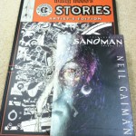
Just so you know, this post does not talk about movie The Artist. I talk about comics. Fair warning.
Before I talk about an Artist’s edition, allow me to explain for the sake of those who came in late, a little behind the process of a comic’s creation. Traditionally, a comic is drawn by hand, with India ink on pencils, ink that is thick, black and lends itself gloriously to the printing processes of the early twentieth century. Pages are drawn on giant boards that are bigger than the final printed size. Then comes the lettering, the word-balloons and sound effects, that would be done either directly on the page, by hand or pasted-on from photocopies done separately. There is a colorist involved as well, yes, but again, due to the limitations of the printing process, the most that colorists could do before the advent of computers was to create color “guides”, done on photocopies of the line art shrunk to publishable size. Printers would use these guides to create the final plates, but it was not necessary that every nuance of the coloring would translate to the final product.
This has substantially changed in recent times, where Photoshop and Illustrator and a variety of other lettering software have transferred a bulk of the coloring and lettering parts of the process online. Some artists even bypass the inking process by allowing their pencils to be directly scanned and enhanced on the computer. And there are artists who stick to the computer for every step of the process – the only physical artifact in that case becomes the printout.
But we talk here about the actual physical art, these boards which, once the printing is done and the comic-book is published and read, used to be treated as disposable trash. While the assembly-line nature of monthly comics has shelved creators into discrete boxes – penciller, inker, colorist, letterer – it is still safe to say that the best kind of artist is the one that does it all. One who is able to not only plan and break down a script into fluid panels on the page, bring them to life by his or her pencils, but also ink, and ink well. Because the inking process is severely underrated and much vilified. Inks not only necessary to show off the contents of the page when they are scaled down to size, but the very thickness of an inked line – its weight – can be used by an experienced inker to convey the import of the artist’s intent with minimum strokes. Less equals more. A good inker can not only ensure that the comic you hold in your hands is as true to the penciller’s vision, but he can sock you in the guts when (- if – ) you hold the board of original art in your hands and see his work up close. This is part of the reason why there is a market for original art. Strip away the nostalgia, and the money-making and the thrill of holding something that is one-of-a-kind, and what remains is the sheer joy and awe of seeing and holding something masterful.
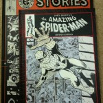
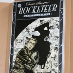
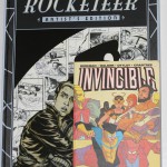
Now fast forward to 2009, when San Diego-based company IDW began a somewhat-bold venture. They took the Rocketeer stories of creator Dave Stevens, and published a giant-sized edition of the work using Stevens’ original black and white art pages. Rather than being a generic facsimile version, this edition was stunning because it was shot in color – what it means is that you can make out textures of the page, the parts that have yellowed, pencils underneath the inks, eraser and whiteout, even coffee stains. It is not an easy task to complete this sort of project because most artists’ pages are spread out among anonymous collectors, making it difficult to track down originals. In Stevens’s case, a bulk of his pages remain with his estate, and the people involved in the project – editor Scott Dunbier, Seinfeld writer David Mandel and collector Kelvin Mao were uber-collectors of Stevens’ work themselves. The successful sell-out of The Rocketeer Artist’s Edition prompted more volumes to come out – a 10-issue selection of Walt Simonson’s run on Thor in the eighties, and a selection of John Romita’s work on Spider-man, among the superhero comic runs most celebrated for their precise, heady combo of art and story.
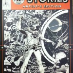
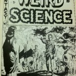
Wally Wood’s work was picked for the next Artist’s edition, a departure from the superhero genre of the previous volumes. (Since it’s stupid to talk about biographies when you can easily read about it on Wikipedia, here’s a handy link. )Wood was one of the old guard, in a class of his own, who cut his teeth on the legendary EC comics of the fifties. He’s not too well-known outside fandom, mostly because he worked on non-mainstream horror, science fiction and war comics, did a lot of underground stuff in the seventies, and then proceeded to kill himself in 1982. Most of his original art is still together as full stories, partly because of EC publisher Bill Gaines’ foresight and in part because original art collectors were rabid enough to want to own complete stories by him. The Wally Wood Artists’ Edition collects some of the best of Wood’s stories from the 1950s. It is even more ambitious than the other releases because it seeks to reprint pages that were drawn on “twice-up” sizes, about 14 by 20 inches. That makes it humongous, maybe the biggest book I’ve seen barring the Little Nemo and Gasoline Alley books brought out by Sunday Press.
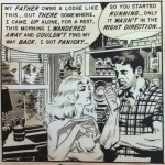
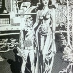
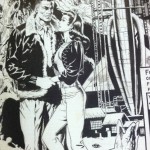
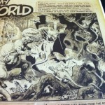
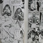
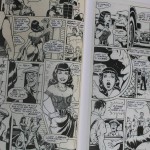
The cover itself is gorgeous, the kind of science fiction tableau where every brush stroke, every blotch of black feels economical and yet loaded with intent. Opening it the first time gave me the sock-in-the-guts that I was talking about before. As I flip through the pages, it seems impossible not to linger, to peer at a splash of correction fluid here, at a pasted-on correction that has aged less than the panel surrounding it, making it seem whiter than the yellowing art board. You want to caress the zip-a-tone paste-ups that Wood uses to convey three-dimensionality in his backgrounds and the effects, like reflection in the water, or a pattern on a carpet. The women he draws remind me of stars of silent black-and-white cinema, a Harlow here, a Garbo there, voluptuousness of a Mae West in another. The men likewise bear the stamp of square-jawed matinee idols. But at the same time, Wood does not hesitate to coat them in grime, sweat and mud, to add a seven o’clock shadow to the craggy face of a handsome protagonist, or wrinkles and crow’s feet to a face to convey age.
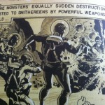
The EC stories are typical science and shock-fantasy fiction of the time, eight-ten page tales book-ended between a gorgeous splash page that lay down the story’s milieu and a twist ending that is the payoff. The verbosity of the writing sometimes gets to me, the art groaning under the narrative captions and thought balloons and a profusion of dialog boxes. What is surprising is the lack of sound effects – the only obvious ones are screams. “Yaaaaaah”, goes a man in a panel from a 1948, grimacing with pain, and then ‘Eeeeyaaahhh”, as if the single scream was not enough to convey the horror of the scene. The story, by the way, is adapted from Ray Bradbury’s Martian Chronicles, EC being among the first to adapt sci-fi stories written by contemporary writers into comic-book form. You see the obvious influences of the Pulp illustrators, and the newspaper greats – Hogarth, Caniff, Foster and Raymond – in Wood’s work (to be fair, these giants cast a long shadow – take anyone from Frazetta to Williamson to Will Eisner, and you will see veins of inspiration that lurk beneath the creativity). But what stuns is the dynamic imagination that oozes from his designs of prehistoric and futuristic monsters. From the bold storytelling choices that he makes to convey something as momentous as an atomic bomb explosion or a medieval joust. The tingle of erotic excitement from a woman’s body wrapped in a sheet. The frantic urgency of a rain-soaked battlefield.
I will probably never own a definitive Wally Wood page of my own, but owning this volume kind of soothes the longing, and tells my pleasure centers to have patience. Good art is calming in its own way, and especially art of this caliber. IDW is coming up with two more volumes in the next few months, one of them being a Will Eisner collection, of the same size as the Wood book. The other is Frank Miller and David Mazzucchelli’s Daredevil: Born Again. It’s hard to get them unless you pre-order, but these are books that ought to take pride of place on your shelves. Highly, highly recommend that you buy them.