Toons

Steamboat Willie, Ub Iwerks and Walt Disney

Steamboat Willie, for those who came in late, was the third Mickey Mouse short developed by Walt Disney and his two-man team of animators after they were kicked off the Oswald the Lucky Rabbit series. The first two, Plane Crazy and Gallopin’ Gaucho were fairly straightforward gag reels. In the first, the cheeky little mouse tried to build a plane, succeeded and asked Minnie to ride with him. While in the air, he tried unsuccessfully to kiss her, a somewhat disturbing sequence because you don’t really expect to see the iconic character forcing himself on his soon-to-be-constant girlfriend. Galloping Gaucho has Mickey as a cowboy ( riding a bird, which wikipedia tells me is a rhea, and not an ostrich as I believed), encountering arch-nemesis Peg Leg Pete for the first time, as he abducts bar dancer Minnie. Cowboy Mickey sets off in hot pursuit on a thoroughly-sozzled bird, indulges in a stylish swordfight with Pete and rides off with Minnie into the sunset.

The two failed to evoke much interest because they were too similar to other funny animal cartoons of the time. Disney therefore began work on a third Mickey Mouse short, ambitiously decided to add sound to it, voicing the lead character himself in a falsetto that jars the first time you hear it. With Mickey as a jaunty sailor aboard a steamboat, it had recurring characters Peg Leg Pete as the ill-tempered captain and Minnie as a musical-minded passenger. Though billed as a “talking toon”, none of the characters have much to say. Minnie and Mickey squeal at opportune moments of distress and astonishment, Pete brays in anger and a mischieveous parrot laughs sarcastically at Mickey’s ill-treatment at the hands of the captain. What must have captured the popular imagination at the time, because Steamboat Willie was a roaring hit, unlike its predecessors, was the seamless use of music in the narrative. That, and the zany humour of Ub Iwerks.

Iwerks was one of the animators who stuck with Disney after the botched Oswald deal. Willie is billed as ‘a Walt Disney Cartoon, drawn by Ub Iwerks’, and it’s without doubt Iwerks’ magical hand that makes for much of the charm of the cartoon. At the peak of his career, he was rumoured to be drawing more than 600 figures a day, with Disney and Les Clark both chipping in, of course.  While Disney is creditted with coming up with the Mickey Mouse character, after a pet mouse named Mortimer he had, Iwerks was the guy who fleshed out the familiar iconography – the circular ears, the short pants, the scraggly tail. Biographers portray Disney as the ambitious extrovert, the business-minded brains of the organization, while Iwerks was the sturdy work-horse artist chained to his table, demanding the most of his apprentices as Disney Studios began to expand.

A lot of weirdness pervades the six and a half minute Steamboat Willie. Pete barges in on the happy mouse whistling a tune to himself, infuriated by his carefree attitude at the rudder, he pulls at Mickey’s midriff, stretching it out like rubber. Which Mickey stubbornly rolls and puts back in his pants. Pete chews a wad of tobacco, a tooth magically slides open to allow him to spit the juice out, and the spittle richochets back into a hanging bell. Much amused, Pete tries it again, turning to the bell to see it ring again; the juice lands squarely on his face. Seventy years later, the sequence still manages to make me ( and the eleven-year-old son of a friend, who is watching it with me ) double up in laughter. Much unpolitically-correct hilarity follows when Minnie boards the boat – actually, Mickey helps her board with the help of a rather bashful hook, and a goat chews up her sheet music. The scene then becomes what Disney productions would soon be famous for – their song and dance sequences. Mickey proceeds to make music out of the most unlikely instruments – a washboard, squealing piglets, a cow’s teeth, even by whirling a cat by its tail.

The groan-worthy bit is that Disney evidently found that the song and dance sequences were more crowd-pleasing than the completely irreverent humour in the short. The flurry of Disney shorts that followed – sixteen in 1929, with twelve of them featuring Mickey, including The Barn Dance,The Opry House, When the Cat’s Away, The Karnival Kid – were all productions that showcased some musical set-piece with the characters. In most, notably The Opry House and The Barn Dance, the music was the only glue holding it all together, the gags far apart and  added almost as an afterthought. They evoke an occasional smile, but do not enthrall you the way Steamboat Willie did, with its frenetic pace and no-holds-barred humour. Needless to add that Mickey Mouse, having become the official “face” of Disney, would no longer be the rascally Iwerks version he was in Plane Crazy and Steamboat Willie. Ultimately he would become a mouthpiece for energy conservation ( in a free comic distributed by Exxon in the late 1970s) and even a presidential candidate. One might argue that Disney’s clear-cut, family-friendly animation that kept the American cartoon industry stuck in a rut until the 90s, until the likes of Groening, Lasseter and Parker/Stone made the medium relevant again with their seminal vision, but financial success never eluded Disney and his legacy well until the eighties.

Ub Iwerks had a fall-out with Disney in 1930, just two years after Mickey Mouse came into being, when he chose to found a short-lived animation studio of his own with the help of a financier who was on the verge of bankrupting Walt Disney. Nothing much came out that venture, while Disney went from strength to strength. Over time, it’s not even evident that Mickey Mouse was a co-creation, not just one man’s vision, especially because latter-day releases on video and DVD avoid Iwerks’ name altogether. Iwerks did return to the Disney studio later, and worked on some visual effects for the company, but a host of talented newcomers had taken over most of his old ground.

This is one of the failed collaborations that bring to mind ideas of what might have been had the two friends remained partners – would Disney have come out of the song-and-dance template that it sank into in the decades that followed, had Iwerks been around?Or would Iwerks have faded into obscurity anyway, the way non-business-minded halves of partnerships seem destined to be? ( think Kirby/Ditko and Lee, Waeerkar and Pai).

( thoughts brought about after downloading a 36 GB gigatorrent of Disney shorts)
Standard
Comic Art, Comics, Panel Eulogy

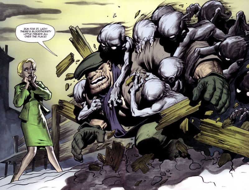
Panel Eulogy: The Goon v3 issue 17


A bit of a cheat, this panels actually a 2-page spread

A bit of a cheat, this panel's actually a 2-page spread


Eric Powell’s The Goon is an achievement in itself. You’ve heard this story before – aspiring comic creator comes up with a character idea that evolves from doodles on sketchpads to something more fully-fleshed-out, the pitch is rejected by mainstream comic publishers, creator improves on his ideas, self-publishes his comic, and a phenomenon is born. The only variant to this starry-eyed story is that Powell’s creation was first published by Avatar Press at first as a black-and-white series, and after three issues, Powell stopped producing new material, waited for the contract to expire and then began to self-publish the series himself. By this time, the positive buzz on his horror-comedy series was high enough for Dark Horse comics to come a-knocking at his door, apologetic about passing on his series the first time he pitched it to them. The very first issue of the Dark Horse debut won him an Eisner for “Best Single Issue” in 2004, and since then, Powell’s been getting better and better. The Goon has consistently maintained its balance of outrageous farce, over-the-top violence and fine storytelling and the artist himself has evolved considerably since the early Avatar days. 

Because the series is mostly a one-man show, Powell allows himself to indulge in all kinds of visual experimentation in his issues. His art style, once rough and punctuated by scratchy inks, morphed into a lush painterly look as he began to use ink washes. His figures have a three-dimensional quality, as you can see in the panel above. The backgrounds are very understated, and it’s interesting to note how much he manages to imply with his minimal strokes and shades. Look at the background closely. A few clouds, the outline of an house, both rendered with a smoky feel that brings out more character in this snow-covered scene than a million spelled-out details ever could. At this stage, Powell was doing everything, including the colors – and oh good God, the colors are gorgeous! They do not have the murkiness that you see in many modern comics, the over-use of photoshop filters that end up making the final product look kitschy or just too dark to make out anything. ( The colors are now done by Dark Horse veteran Dave Stewart, to allow Powell more time to concentrate on the story and the art. )

Just like Mike Mignola does in Hellboy, Powell uses a very distinct look for his lead character, Goon, who’s the one hurtling through the fence above. The character’s appearance is fairly unchanged throughout, the cap shielding his eyes, the scar across his face, the gloves, the working-john’s clothes – in a way, I think of the Goon as the twenty-first century version of Popeye ( and I refer to the original the Segar strips here ), a laconic, violent rough-neck who can take a punch and dish it right back, with an extra one thrown in for luck. You can be sure that all these blood-thirsty little freaks get their just desserts in the next couple of pages. 

Part of the appeal of this particular panel – yeah, ok, two-page spread – is the way the violence intrudes into the reader’s ken. The few pages that lead to this one is a slow set-up, featuring a nifty tribute to a memorable sequence in Alfred Hitchcock’s The Birds, in which Tippi Hedren is smoking near the school and the birds begin to congregate, slowly, on the jungle gym. Here, it’s the lady you see in this panel and these vicious-looking creatures gathering around as she smokes a cigarette – you don’t know anything about her, just that something bad is about to happen, and you mentally prepare yourself for the inevitable end to which unknown supporting characters are subjected to in examples of the horror genre. And then Powell has to go and introduce our burly protagonist in a spectacular fashion, shattering genre conventions, and our expectations in this magnificient panel.

Do yourself a favour, and pick up The Goon. The early Avatar issues are a little rough, but by the time you come across this panel, you will be ready to worship Eric Powell. And while I know this sounds very cliche, The Goon just keeps getting better and better, as Powell begins tampering with the status quo he has laid down in the initial years of his saga.

Standard
Comics

Rolling Stone India: The Graphic Novel Column Archives 2

(Originally published in Rolling Stone India, April 2008)

Absolute Sandman Volume 1
Writer: Neil Gaiman
Artist: Sam Kieth, Mike Dringenberg, Malcolm Jones et al.
Publisher: DC/Vertigo

“I will show your fear in a handful of dust.”
In 1987, when DC advertised a new horror series with this tagline, accompanied by an image of a pale, gaunt man with dark eyes and wild hair, not many readers recognized the source of the words (TS Eliot’s The Wasteland, in case you didn’t either) and no one really thought the series, a re-imagining of a lesser-known Silver Age DC character would go on to become the flagship title of Vertigo comics and one of the cornerstones of graphic literature. Two decades later, Neil Gaiman’s The Sandman is being republished as a set of four over-sized ‘remastered’ hardcover books – referred to as the Absolute Editions. The first volume covers the first twenty issues of this seventy-five part series, which introduce us to the world of the Sandman and some of its cast of characters.

The story of Morpheus, Lord of the Dreaming, the anthropomorphic manifestation of dreams begins in tragedy, when members of a cult, in 1916, capture the dream lord and ensnare him in a magical barrier for the better part of the twentieth century. His subsequent escape seventy years later is not the end of his troubles, because without his tools – a helmet, a bag of sand and a ruby, all of which were taken away by his captors – he cannot regain control of the Dreaming. The first seven episodes of the story then takes the form of a fairly straightforward quest, in which Morpheus interacts with the various beings in the DC Universe, including the mage John Constantine and the Justice League of America, and visits Lucifer in Hell – all to reclaim his rightful powers.

In the eighth episode, Gaiman produced a quiet, introspective story that introduces Dream’s sister, Death, re-imagined as a kind, perky sixteen-year old girl, contrary to genre conventions. The positive reactions to that story made Gaiman bolder – like Alan Moore, his spiritual guru in comics, he began to experiment with different techniques, weaving an intricate tale of 22-page chapters that hop across centuries and include an immense cast of characters, taking his own sweet time to create a world that built upon the previous history of the character. The Sandman began as a horror title, and believe me, there are moments of creeping terror in the early arcs – like in the Dr Destiny sequence ’24 hours’ or the Cereal convention subplot in The Doll’s House, but as it progressed, the series slowly morphed into something that was a combination of literary wit, high fantasy, mythology, and solid storytelling. Greek myth, Shakespeare, superheroes, Biblical characters and African legends rub shoulders in these early stories, notable ones being ‘Calliope’, in which Gaiman tries to answer the perennial question faced by writers – “where do you get your ideas from?” and the heartbreaking ‘Dream of A Thousand Cats’, in which, and this is all I can say without spoiling your first-time experience, the origin of the world is explained.

The refurbished collection, encased in a faux-leather cover is a bibliophile’s (dare I say it?) dream come true. The volume has series colorist Daniel Vozzo redoing the murky colors on the first eighteen issues, originally the result of primitive printing techniques. One of the mainstays of the Sandman series is the use of rotating artistic teams for the different storylines, each artist interpreting the characters in their own style. The art nouveau influences of Charles Vess and Michael Zulli are used in period pieces set in medieval times, the dark, sooty ink-work of Sam Kieth and Mike Dringenberg bring out the malevolent nature of the early storylines, and Dave McKean’s abstract imagery graced all the 75 covers. The high-quality paper and the larger size of the Absolute Edition make the artwork leap off the page with spectacular clarity. Adding to the joy is 70 pages of extra material at the end of the book, which includes Gaiman’s original proposal for the series, concept sketches by various artists, and to top it all off, the original script and art breakdowns to Sandman #19, the only comic to win a World Fantasy Award. What more could you ask? Buy this book before it goes out of print, your bookshelf will thank you for it.

_______________________________________________________

The Complete Don Martin
Writers: Don Martin, various
Artists: Don Martin
Publisher: Running Press

Mad Magazine treads into coffee-table territory with a series of hardbound collections called Mad’s Greatest Artists. The first such offering, The Complete Don Martin is a gorgeous behemoth of a book, collecting the entire oeuvre of the great creator in a two-volume slip-cased edition. Printed on high-quality paper with flawless reproduction are all of Don Martin’s strips, the all-too-rare TV and movie adaptations, cover paintings, posters, postcards, and even pencil prelims. A neat bonus is the inclusion of occasional essays by Martin’s colleagues (‘the usual gang of idiots’, to use Madspeak), with names like Sergio Aragones, Dick DeBartolo and Al Jaffee relating anecdotes and opinions about the great artist’s work.

Martin, often billed as ‘the maddest Mad artist’, started his career with the venerable magazine in 1956. As you leaf through the early reprints, you realize that the first years suffer from the malaise common to most long-running strips – that of the creator trying to find his groove – and floundering in parts. These early strips, while funny in their own right, have Martin experimenting with verbal gags, a little unsure with his figure structures and trying his hand at extremely dark humour. While these are far from unfunny, they are nowhere as bizarre and laugh-out-loud as what his later work would be, and one feels the urge to skip these parts as quickly as possible.

From the sixties, the change in his style becomes apparent, the figures attaining their trademark extended shape, the strips hitting their stride, and the trademark sound effects – exploding flowers (SKLISHK!), dead fish ricocheting off a face (GLUP! SHPLIPPLE! FLADDUP!) and my personal favorite, two frogs catching each other with tongues. (ZAP GING GING TWONG SPLAT!). By the time we are into the second volume (which covers 1975-1988), Don Martin has become the Don Martin we all know and love.

Highly recommended!

______________________________________________________

The Art of Sin City
Writer & Artist: Frank Miller
Publisher: Dark Horse.

In case you’ve not read Frank Miller’s Sin City yet, do yourself a favour. Stop reading this right now and go buy the series. Miller’s chiaroscuro masterpiece is not only a ripping good yarn; it’s also got the most eye-catching artwork in comics today. And after you’ve read all nine of the trades and are tempted to pick up The Art of Sin City, my advice would be to save the trouble, and buy something else.

Art books based on comics aren’t uncommon –Alex Ross’s Mythology and Mike Mignola’s Art of Hellboy comes to mind as two of the recent good publications that raised the bar for creators and publishers. But unlike these two, and all the other art books that actually give an insight into a creator’s mind and a deeper understanding of his craft and his process, The Art of Sin City concentrates on reprinting key panels from the actual series, blown to full size, with an odd preliminary pencil drawing or two thrown in. This, truth be told, is not entirely a bad thing if you are looking to admire the minimalist style that goes into the making of Sin City. Also, some of the images are from trading cards, alternate covers and advertising artwork, most of which are hard to find, making this the only book in which you will get to see them.

But staring at 150-odd pages of poster-quality artwork of naked women and men with guns with gets tedious, especially when apart from the preface, there’s no text to be seen anywhere. Miller’s conceit seems to be that his drawings alone have the clout to justify a price tag of 39.95$ (roughly Rs. 1350). Strictly for completists and hard-core Sin City fans.

Standard