Comic Art, Comics, Panel Eulogy

Panel Eulogy: The Goon v3 issue 17


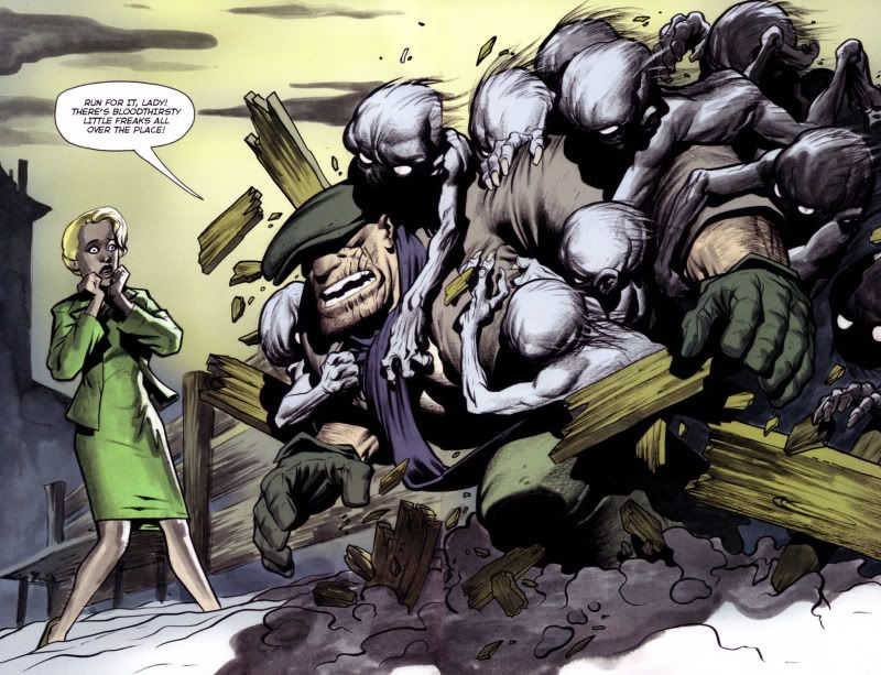
A bit of a cheat, this panels actually a 2-page spread

A bit of a cheat, this panel's actually a 2-page spread


Eric Powell’s The Goon is an achievement in itself. You’ve heard this story before – aspiring comic creator comes up with a character idea that evolves from doodles on sketchpads to something more fully-fleshed-out, the pitch is rejected by mainstream comic publishers, creator improves on his ideas, self-publishes his comic, and a phenomenon is born. The only variant to this starry-eyed story is that Powell’s creation was first published by Avatar Press at first as a black-and-white series, and after three issues, Powell stopped producing new material, waited for the contract to expire and then began to self-publish the series himself. By this time, the positive buzz on his horror-comedy series was high enough for Dark Horse comics to come a-knocking at his door, apologetic about passing on his series the first time he pitched it to them. The very first issue of the Dark Horse debut won him an Eisner for “Best Single Issue” in 2004, and since then, Powell’s been getting better and better. The Goon has consistently maintained its balance of outrageous farce, over-the-top violence and fine storytelling and the artist himself has evolved considerably since the early Avatar days. 

Because the series is mostly a one-man show, Powell allows himself to indulge in all kinds of visual experimentation in his issues. His art style, once rough and punctuated by scratchy inks, morphed into a lush painterly look as he began to use ink washes. His figures have a three-dimensional quality, as you can see in the panel above. The backgrounds are very understated, and it’s interesting to note how much he manages to imply with his minimal strokes and shades. Look at the background closely. A few clouds, the outline of an house, both rendered with a smoky feel that brings out more character in this snow-covered scene than a million spelled-out details ever could. At this stage, Powell was doing everything, including the colors – and oh good God, the colors are gorgeous! They do not have the murkiness that you see in many modern comics, the over-use of photoshop filters that end up making the final product look kitschy or just too dark to make out anything. ( The colors are now done by Dark Horse veteran Dave Stewart, to allow Powell more time to concentrate on the story and the art. )

Just like Mike Mignola does in Hellboy, Powell uses a very distinct look for his lead character, Goon, who’s the one hurtling through the fence above. The character’s appearance is fairly unchanged throughout, the cap shielding his eyes, the scar across his face, the gloves, the working-john’s clothes – in a way, I think of the Goon as the twenty-first century version of Popeye ( and I refer to the original the Segar strips here ), a laconic, violent rough-neck who can take a punch and dish it right back, with an extra one thrown in for luck. You can be sure that all these blood-thirsty little freaks get their just desserts in the next couple of pages. 

Part of the appeal of this particular panel – yeah, ok, two-page spread – is the way the violence intrudes into the reader’s ken. The few pages that lead to this one is a slow set-up, featuring a nifty tribute to a memorable sequence in Alfred Hitchcock’s The Birds, in which Tippi Hedren is smoking near the school and the birds begin to congregate, slowly, on the jungle gym. Here, it’s the lady you see in this panel and these vicious-looking creatures gathering around as she smokes a cigarette – you don’t know anything about her, just that something bad is about to happen, and you mentally prepare yourself for the inevitable end to which unknown supporting characters are subjected to in examples of the horror genre. And then Powell has to go and introduce our burly protagonist in a spectacular fashion, shattering genre conventions, and our expectations in this magnificient panel.

Do yourself a favour, and pick up The Goon. The early Avatar issues are a little rough, but by the time you come across this panel, you will be ready to worship Eric Powell. And while I know this sounds very cliche, The Goon just keeps getting better and better, as Powell begins tampering with the status quo he has laid down in the initial years of his saga.
Standard
Comics

Rolling Stone India: The Graphic Novel Column Archives 2

(Originally published in Rolling Stone India, April 2008)

Absolute Sandman Volume 1
Writer: Neil Gaiman
Artist: Sam Kieth, Mike Dringenberg, Malcolm Jones et al.
Publisher: DC/Vertigo

“I will show your fear in a handful of dust.”
In 1987, when DC advertised a new horror series with this tagline, accompanied by an image of a pale, gaunt man with dark eyes and wild hair, not many readers recognized the source of the words (TS Eliot’s The Wasteland, in case you didn’t either) and no one really thought the series, a re-imagining of a lesser-known Silver Age DC character would go on to become the flagship title of Vertigo comics and one of the cornerstones of graphic literature. Two decades later, Neil Gaiman’s The Sandman is being republished as a set of four over-sized ‘remastered’ hardcover books – referred to as the Absolute Editions. The first volume covers the first twenty issues of this seventy-five part series, which introduce us to the world of the Sandman and some of its cast of characters.

The story of Morpheus, Lord of the Dreaming, the anthropomorphic manifestation of dreams begins in tragedy, when members of a cult, in 1916, capture the dream lord and ensnare him in a magical barrier for the better part of the twentieth century. His subsequent escape seventy years later is not the end of his troubles, because without his tools – a helmet, a bag of sand and a ruby, all of which were taken away by his captors – he cannot regain control of the Dreaming. The first seven episodes of the story then takes the form of a fairly straightforward quest, in which Morpheus interacts with the various beings in the DC Universe, including the mage John Constantine and the Justice League of America, and visits Lucifer in Hell – all to reclaim his rightful powers.

In the eighth episode, Gaiman produced a quiet, introspective story that introduces Dream’s sister, Death, re-imagined as a kind, perky sixteen-year old girl, contrary to genre conventions. The positive reactions to that story made Gaiman bolder – like Alan Moore, his spiritual guru in comics, he began to experiment with different techniques, weaving an intricate tale of 22-page chapters that hop across centuries and include an immense cast of characters, taking his own sweet time to create a world that built upon the previous history of the character. The Sandman began as a horror title, and believe me, there are moments of creeping terror in the early arcs – like in the Dr Destiny sequence ’24 hours’ or the Cereal convention subplot in The Doll’s House, but as it progressed, the series slowly morphed into something that was a combination of literary wit, high fantasy, mythology, and solid storytelling. Greek myth, Shakespeare, superheroes, Biblical characters and African legends rub shoulders in these early stories, notable ones being ‘Calliope’, in which Gaiman tries to answer the perennial question faced by writers – “where do you get your ideas from?” and the heartbreaking ‘Dream of A Thousand Cats’, in which, and this is all I can say without spoiling your first-time experience, the origin of the world is explained.

The refurbished collection, encased in a faux-leather cover is a bibliophile’s (dare I say it?) dream come true. The volume has series colorist Daniel Vozzo redoing the murky colors on the first eighteen issues, originally the result of primitive printing techniques. One of the mainstays of the Sandman series is the use of rotating artistic teams for the different storylines, each artist interpreting the characters in their own style. The art nouveau influences of Charles Vess and Michael Zulli are used in period pieces set in medieval times, the dark, sooty ink-work of Sam Kieth and Mike Dringenberg bring out the malevolent nature of the early storylines, and Dave McKean’s abstract imagery graced all the 75 covers. The high-quality paper and the larger size of the Absolute Edition make the artwork leap off the page with spectacular clarity. Adding to the joy is 70 pages of extra material at the end of the book, which includes Gaiman’s original proposal for the series, concept sketches by various artists, and to top it all off, the original script and art breakdowns to Sandman #19, the only comic to win a World Fantasy Award. What more could you ask? Buy this book before it goes out of print, your bookshelf will thank you for it.

_______________________________________________________

The Complete Don Martin
Writers: Don Martin, various
Artists: Don Martin
Publisher: Running Press

Mad Magazine treads into coffee-table territory with a series of hardbound collections called Mad’s Greatest Artists. The first such offering, The Complete Don Martin is a gorgeous behemoth of a book, collecting the entire oeuvre of the great creator in a two-volume slip-cased edition. Printed on high-quality paper with flawless reproduction are all of Don Martin’s strips, the all-too-rare TV and movie adaptations, cover paintings, posters, postcards, and even pencil prelims. A neat bonus is the inclusion of occasional essays by Martin’s colleagues (‘the usual gang of idiots’, to use Madspeak), with names like Sergio Aragones, Dick DeBartolo and Al Jaffee relating anecdotes and opinions about the great artist’s work.

Martin, often billed as ‘the maddest Mad artist’, started his career with the venerable magazine in 1956. As you leaf through the early reprints, you realize that the first years suffer from the malaise common to most long-running strips – that of the creator trying to find his groove – and floundering in parts. These early strips, while funny in their own right, have Martin experimenting with verbal gags, a little unsure with his figure structures and trying his hand at extremely dark humour. While these are far from unfunny, they are nowhere as bizarre and laugh-out-loud as what his later work would be, and one feels the urge to skip these parts as quickly as possible.

From the sixties, the change in his style becomes apparent, the figures attaining their trademark extended shape, the strips hitting their stride, and the trademark sound effects – exploding flowers (SKLISHK!), dead fish ricocheting off a face (GLUP! SHPLIPPLE! FLADDUP!) and my personal favorite, two frogs catching each other with tongues. (ZAP GING GING TWONG SPLAT!). By the time we are into the second volume (which covers 1975-1988), Don Martin has become the Don Martin we all know and love.

Highly recommended!

______________________________________________________

The Art of Sin City
Writer & Artist: Frank Miller
Publisher: Dark Horse.

In case you’ve not read Frank Miller’s Sin City yet, do yourself a favour. Stop reading this right now and go buy the series. Miller’s chiaroscuro masterpiece is not only a ripping good yarn; it’s also got the most eye-catching artwork in comics today. And after you’ve read all nine of the trades and are tempted to pick up The Art of Sin City, my advice would be to save the trouble, and buy something else.

Art books based on comics aren’t uncommon –Alex Ross’s Mythology and Mike Mignola’s Art of Hellboy comes to mind as two of the recent good publications that raised the bar for creators and publishers. But unlike these two, and all the other art books that actually give an insight into a creator’s mind and a deeper understanding of his craft and his process, The Art of Sin City concentrates on reprinting key panels from the actual series, blown to full size, with an odd preliminary pencil drawing or two thrown in. This, truth be told, is not entirely a bad thing if you are looking to admire the minimalist style that goes into the making of Sin City. Also, some of the images are from trading cards, alternate covers and advertising artwork, most of which are hard to find, making this the only book in which you will get to see them.

But staring at 150-odd pages of poster-quality artwork of naked women and men with guns with gets tedious, especially when apart from the preface, there’s no text to be seen anywhere. Miller’s conceit seems to be that his drawings alone have the clout to justify a price tag of 39.95$ (roughly Rs. 1350). Strictly for completists and hard-core Sin City fans.

Standard
Comics

Aren’t you glad I don’t twitter so much?

The more I read comics, the more I realize that Batman and Superman cannot possibly exist in the same universe.

It will take me ten minutes to tell you who Robin is, right now.

It will take me five minutes to explain whether Batman is dead or not.

After reading Whatever Happened to the Caped Crusader, I think Neil Gaiman should stop writing superhero comics. He should have after 1602.

I absolutely HATE how, in DC, every superhero fawns every other superhero. Superman is so awesome?? Wow, we didn’t know, Flash.

And nobody in the JLA uses superhero names anymore – it’s all Connor or Bruce or Diana or Clark.

I think it was Brad Meltzer who began both these trends with Identity Crisis, and now everybody seems to be doing it.

I want to read all the low-key superhero comics released in the last 5 years. Blue Beetle, Manhunter, Ant-Man, The Order. That shit is all good.

Captain Marvel and MI-13 is getting cancelled with issue 15? Just when I was thinking this would be one of my regular monthly fixes.

Now that 100 Bullets is over, I am waiting for the opportune moment to read the complete series. In one sitting. The last time I did that was with issues 1-50.

I also need some time off to read Yoshihiro Tatsumi’s A Drifting Life, an 850+ page autobiographical manga that goes into detail about the beginnings of the manga industry in Japan.

Am still looking for the first two of the three Tatsumi collections that Drawn and Quarterly brought out – I regret not buying them in Blossom when I saw them, way back in 2005 and 2007.

I recently did a Top Ten Superhero Graphic Novels list for a magazine. I am still feeling guilty about the ones I left out.

Did I tell you about the time I found a better-than-decent issue of Batman 181, the first appearance of Poison Ivy, for 10 Rs at the Sunday book market?

Hayao Miyazaki has returned to drawing manga after a long time, with a biography of an aircraft designer released in early 2009.

What is it with Miyazaki and flying?

Comicbook culture would have reached its peak the moment all of Tezuka’s works and all the Koike/Kojima collaborations are translated and in print.

Another manga-ka whose works are begging to be translated – Sanpei Shirato. The dynamic storytelling in Kamui, the only one of his works translated so far, still manages to leave me breathless.

Blade of the Immortal is in its final arc in Japan, a couple of more years and Dark Horse will come up with the last volume. Fist-pump!

Now if only Kentaro Miura would get off his ass and finish Berserk.

Alan Moore’s Miracleman scars you for life. Don’t read Miracleman if you want to keep enjoying superheroes.

The densest work Miller has ever written is The Dark Knight Returns. Elektra: Assassin is a close second. The 8th issue has got to be one of the greatest endings ever.

Like everyone else, I also hated Miller’s Spirit. The nadir was the part where the female cop says ‘Elektra complex’ some eighteen times in a row.

And this whole cliche of naming minor characters and landmarks in superhero movies with names from the comicbook industry makes me spew.

Yes, all that was fan-service.

Neal Adams, Norm Breyfogle and Kelley Jones are the three greatest regular artists to draw the Batman.

Brian Bolland never did a monthly stint on Batman, so there. Mazzuchchelli did only four issues, and Don Newton died too early.

JH Williams 3, Frank Quitely, and Darwyn Cooke are three names that will make me buy a comic without stopping to check what lies within.

Chuck’s bedroom ( in…uh…Chuck) has a poster of Y The Last Man.

Juno’s bedroom ( in…well…Juno) has a poster by Tara McPherson, she who did the Snow-Rose-Totenkinder story in Fables: 1001 Nights of Snowfall.

I own a first printing of Will Eisner’s Contract With God. Should I still buy the new reissue of the Dropsie Avenue trilogy?

Standard
Comic Art, Comics, Music, Panel Eulogy

Panel-Eulogy

Flash Gordon - The Witch Queen of Mongo

Flash Gordon: The Witch Queen of Mongo

This panel is from Alex Raymond’s Flash Gordon, among the most revered comic strips of the early 20th century, from a storyline called “The Witch Queen of Mongo”. Hard to imagine that it was published in May 1935, and appeared in family-friendly Sunday newspapers considering the kind of hullaballoo made nowadays over much more innocent imagery.

Why I like the panel so much is in part due to Raymond’s god-level figurework – Dale’s posture as she undergoes her punishment resembles a figure from a classical painting. The movement of the woman with the whip is captured without the any visual trickery – no speed-lines or sound effects that you see in modern comics. Raymond keeps the background to a crisp minimum, using stray crosshatching and Dale’s shadow to convey the presence of the wall to which she is bound. The other reason is because of the obvious way in which it is constructed to appeal to its target audience. At that time, I am betting that the greater percentage of readers following Flash Gordon comics was teenage boys – and isn’t this image just a right mix of taboo and titillation? If I were thirteen and I saw this panel in my Sunday newspaper, I would make sure I cut it out and keep it safe before the newspaper gets trashed the next day. And I know I would look at it again and again, when I was sure there was no one around. When I saw this page while flipping through the book for the first time, I had to pause and stare, for quite some time. I have to admit that the scan above does not do the actual color artwork justice – not to mention the fact that Raymond’s actual inked pages still have it in them to make eyes of grown men pop with awe and disbelief.

Indrajal comics never printed these original pulp stories in India. They got the Dan Barry run, which is good as well; but it was Raymond’s run that laid down the mythology of Mongo and its inhabitants and stands on its own as a fascinating, self-contained bunch of space yarns. One cannot really call the somewhat-repetitive storylines worthy literature. A standard template of a Raymond Flash Gordon story would go this way – Flash, Dale and Zarkov meet a hitherto unknown tribe on Mongo, and one of whom is a hot woman who falls for him; a rival in the tribe first envies Flash and his obvious charisma, and then either repents or dies, and there is a final showdown with Emperor Ming who shows up to conquer the tribe but fails, thanks to Flash’s uber-Aryan combination of brains and brawn. But it would also be wrong to dismiss them as vapid pulp – there’s definite plot development, the trio even come back to to Earth and use Mongo technology in WWII, and Flash and Dale’s romance grows over the episodes. What’s most striking is the iconic artwork of Alex Raymond, whose brush strokes brought the fantastic creatures and landscapes of Mongo to life, and who fanned the flames of adolescent desire and imagination with his skill.

Checker Books has reprinted the complete run of Raymond’s Flash Gordon in seven hardcover volumes, and it’s well worth your time to pick them up if you can. My collection has five of the seven volumes – Book 3 is apparently out of print, and Book 1 was not available along with the rest in Odyssey, where my girlfriend picked them up for me in February.

Standard
Comics

Rolling Stone India: The Graphic Novels column archives

(This was published in the first issue of Rolling Stone India, cover dated March 2008)

Black Dossier

League of Extraordinary Gentlemen: The Black Dossier

The League of Extraordinary Gentlemen: Black Dossier
Writer: Alan Moore
Artist: Kevin O’Neill
Publisher: DC/Wildstorm

What if the protagonists of the numerous novels of the nineteenth century co-existed in a fictional world? Writer Alan Moore and artist Kevin O’Neill led this idea forward through two volumes of comics called The League of Extraordinary Gentlemen, each spanning six issues, in which Mina Murray from Stoker’s Dracula, the rugged hero Allan Quatermain, Captain Nemo from Verne’s stories, Mr Hyde (with Dr Jekyll in tow) and Wells’s Invisible Man fought Oriental villains and Martians. At the end of the second volume, the League was disbanded, its members at odds with each other. The third installment, called The Black Dossier was released recently, and it differs from the previous volumes in three respects – one, it is a standalone volume; two, it is no longer confined to the setting and characters of the Victorian Era; three – and the most important difference of all, it’s not really a comic book.

The year is 1958, and a remarkably youthful Mina Murray and Allan Quatermain are in London after a file called The Black Dossier, which contains confidential information about all the previous incarnations of the League that were formed throughout history to carry out covert operations for England. They have to escape a posse of MI5 espionage agents led by a spy referred to as “Jimmy”, Emma Night and Hugo Drummond, and if you cannot identify two out of these three, you probably wouldn’t enjoy this book – and make their way to the fourth dimension. In the middle of the pursuit, they read sections of the dossier, and this brings out the real meat of the book, as Moore and O’Neill narrate the history of this fictional world in the form of letters, segments of literary works, maps, schematics, excerpts of autobiographies and comic book sections, including an example of Tijuana Bibles.

In every section, Moore writes in a style corresponding to the genre and content. For instance, Faerie’s Fortunes Founded claims to be a lost play by William Shakespeare written in the style of the Bard himself, The Crazy Wide Forever is a stream of consciousness ‘beat’ novel supposedly by Sal Paradise, the narrator of Kerouac’s On The Road, and the most hilarious pastiche of them all (and my personal favourite), What Ho, Gods of the Abyss by Bertie Wooster is a look at the Lovecraft canon in a Wodehousian vein.  Kevin O’Neill’s artwork shines in all these sections – he is equally at home drawing dynamic action sequences , cartoony meta-comics and detailed ink etchings echoing early twentieth-century illustration plates. At the end of the book, when the duo reaches the Fourth Dimension, the sequence is represented as a 3-D sequence (yes, you have to wear cardboard glasses that come with the book) and even there, Moore and O’Neill make use of the technology to come up with stunning effects – a Lovecraftian elder god speaks in illegible runes, close your right eye, you see the English words form behind the gibberish.

The book is more of a framing device and less of a story, an ambitious attempt to map all of known literary fiction into a single coherent world, with the story leading in to the actual third volume due next year. Nearly every page of the main graphic novel contains references to fictional characters from British literature, TV series, comics and popular culture.  And as is normal in a work of such ambition, the question here is this.

Would you enjoy it?

If you are a fan of comic books and comics alone, probably not – which explains the lukewarm response the book got from those who embraced the boy’s adventure spirit of the earlier two volumes. The Black Dossier is a different beast altogether, it requires you to come to the reading table with an awareness – if not in-depth knowledge – of pop culture, an ability to context-switch between different time-periods, storytelling devices and above all, with time on your hands. There is just too much going on in the book to take it all in at one sitting, and there is a high chance that the volume of content and information proves to be overwhelming. It took me nearly two weeks to get through all the segments, in case you’re wondering.  That said, it truly is a tremendous piece of work, quite unlike any comic book that has come before. Not quite ‘the best thing since sliced bread’, as Moore mentions in his pre-release interviews, but definitely one of the best graphic novels of 2007.

_______________________________________________________

Essential X-Men vol 1

Essential X-Men vol 1

Essential X-Men Volume 1
Writer: Chris Claremont
Artists: Dave Cockrum, John Byrne and Terry Austin
Publisher: Marvel comics.

If you like the X-men movies and want to get into the comics without treading into confusing continuity, check out this particular reprint edition, that presents Giant-size X-men #1 and the subsequent issues 94-119, the 70’s stories that resurrected the classic X-Men team from a comic on the brink of cancellation to a best-selling title. Chris Claremont’s scripts laid equal emphasis on multicultural elements of our favorite mutants, space opera, inter-team friction and individual character development, while artists Dave Cockrum, John Byrne and Terry Austin brought in realism with their dynamic line-work. The first appearances of Storm, Colossus and Nightcrawler, the death and subsequent rebirth of Jean Grey into Phoenix, arch-villain Magneto’s triumphant return, and Professor Charles Xavier’s romance with intergalactic Empress Lilandra – these are the stories that laid the groundwork for (arguably) the greatest Marvel story ever – the Dark Phoenix Saga. And who would have thought that a B-grade character called Wolverine would be catapulted to superstardom – becoming the poster-boy of the grim and gritty comics of the eighties – by virtue of being included in this title?

Reading this volume brings back a warm feeling of nostalgia at how straightforward comics were back then – villains indulge in bombastic monologues outlining their plans in detail, every fight sequence has characters talking nineteen to the dozen, and in different dialects too! But make no mistake about it, these stories are groundbreaking and classic – modern Marvel writers (as well as the scriptwriters of the X-men movies) are still borrowing the mythic elements Claremont and Byrne put in place in these initial issues.  Consider your money well-spent.

______________________________________________________________________

Lucky Luke: Jesse James

Lucky Luke: Jesse James

Lucky Luke: Jesse James.
Writer: Goscinny
Artist: Morris
Publisher: Tara Press, India.

All you Tintin and Asterix lovers, time to rejoice! The classic series Lucky Luke, written by Rene Goscinny and illustrated by Morris is now available in India. Lucky Luke is a madcap adventure series about a fearless, resourceful and slightly loco cowboy his equally loony horse, Jolly Jumper as they travel through the Wild West, helping those in distress. In the first volume, ‘Jesse James’, the villain tries to be a modern-day Robin Hood – he robs a rich man, gives the money to a homeless vagrant, and when he finds out that his gift has made the latter wealthy, proceeds to rob him. He finally decides to keep the money for himself, to avoid any such moral quandaries in the future.  With his Shakespeare-quoting elder brother Frank, and a witless associate named Cole Younger, Jesse James strikes terror in the West with his bank and railroad heists. Until one fine day, two Pinkerton detectives employ Lucky Luke to capture the James gang before they rob the bank in Nothing Gulch, Texas.

The book is, in one word, fun! Unlike other European cowboy comics like Blueberry and Tex Willer, Lucky Luke eschews realism in favor of humor, substitutes spaghetti violence with cartoon lunacy and is appealing both to kids and adults. I laughed aloud throughout the book, and look forward to reading the remaining four volumes as soon as I can.  Thanks are due to Tara Press for bringing this classic series back into print, with a brilliant translation and an album-sized release.

Standard