I put up a couple of new pages on my Comic Art Fans gallery. Stuff that I bought or picked up in the USA following time payments.
A Dark Victory page by Tim Sale. It’s in fact one of the last pages in the series – just before the final sequence. One of the best images of Two-face I have ever seen. If you think Tim Sale is a brilliant artist, you should hold a piece of his original art at close quarters and look at the details to appreciate HOW good he really is.
A Trinity page by Matt Wagner. The page has Superman, Batman and Wonder Woman, and some of the coolest Matt Wagner inking you will ever see. I am a MW junkie, having discovered the guy’s work in the Demon miniseries published by DC in the 1980s. His recent work includes the Dark Moon Rising miniseries starring Batman, which are modern reimaginings of Batman’s earliest adventures. Batman and the Monster Men is the first Hugo Strange story, Batman and the Mad Monk tells the story of the vampirish Mad Monk, one of the earliest Bob Kane stories.
An Usagi Yojimbo pin-up by Stan Sakai. I don’t really know if this is a published pin-up, but Sakai tends to use these kind of inked drawings as back cover images or inside the comics as bonus pinup material. Someday I need to get my paws on an Usagi Yojimbo cover.
A Loveless page by Marcelo Frusin. Marcelo Frusin is another artist from Argentina who makes perfect use of black and white in his work, much like Risso, his fellow countryman ( I believe he trained under Risso for some time). Loveless is an ongoing Western comicbook series written by Brian Azzarrello, and this page is from one of the earliest issues. It’s also special because it’s inked, most of Frusin’s available art is pencils only.
A New X-Men page by Frank Quitely. Yes, I promised myself I will get more and more Frank Quitely art, and that’s exactly what I am doing. This is one of my favourite pages from Grant Morrison’s run on New X-Men.
Another Frank Quitely work, a sketch of Death. What can I say? I love the guy’s work.
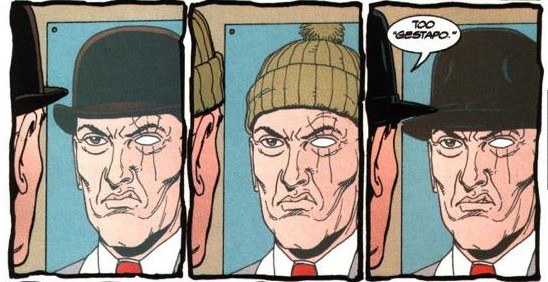
A Starman page by Tony Harris. Starman, frankly speaking, is one of the most respectful DC series you will ever read. It brings a rich sense of history to a character whose shelf-life has been very choppy in the DC Universe, with multiple people taking on the mantle of Starman, with different powers and origins. James Robinson, Tony Harris and all the others who chipped in as the 80 issue series progressed revisited the history of Starman and brought a cohesiveness to it that blows all such reimaginings out of the water. This page also features the Golden Age Sandman, Wesley Dodds, from one of the best storylines in the series, called Sand and Stars.
Well, like ’em?
I adore Tim Sale’s art style for the most part. His work on the Penguin in the very same series is hideous as all fucking get-out, but mostly I think he’s awesome at what he does.
You either like Matt Wagner’s style or you don’t. I am in the former group. He’s got all kinds of wickedness in his shorthand look for the characters. I respect it greatly.
Stan Sakai is obviously a cartoony style, but it is clean. It is detailed without being overdone, straightforward without being simplistic.
Frank Quitely? I’m not really sure why he gets work. His characters are uniquely fugly, and I loathe everything he touches.
I can actually see why you would think that way about Frank Quitely. Even I didn’t quite dig his art at first ( JLA: Earth 2 was the first work I read), but it grew on me to such an extent that now I think he’s really really good and want to own all of his art. :-)
I also see that the page I posted, the New X-men page, has Jean Grey’s feet as overly long. But there is a particular style to it, can’t really put my finger on it and explain. I just like it!
Matt Wagner… AAAAAAAAAAAAAA… Hate you.
And a Marcelo Frusin. Fucking Hell.
Watch out for more stuff – will be uploading very soon. :-D