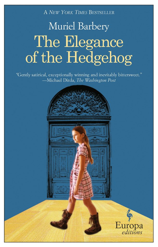
It’s rare for me to buy books without having a solid reasoning framework built in my head. There are enough titles on my shelves, both analog and digital, to keep me entertained for the next century and a half. But I bought Muriel Barbery’s Elegance of the Hedgehog and Gourmet Rhapsody just because I liked how the books looked. It also helped that they were a dollar each, but mostly, I liked how they looked.
I read Hedgehog last month, and while I had reservations about parts of it, especially the ending, the book is just the right combination of bittersweet story and sugary pop philosophy. Some of the “deep” bits are a little too heavy on the cream and sugar, but it’s the focus on the characters that save the book from becoming a cloying souffle. Renee, the secretive autodidact who runs a building without revealing her love of Russian literature and Japanese film to the world at large, and seeks to lead a life of painful mediocrity because of a lifetime of class-based presumptions that come her way. And twelve-year old Paloma, a resident of the same building, who thinks the world does not contain anything that could surprise her, and whose plan for her next birthday involves suicide. The first part of the book shows us parallel lives that occupy the same geographic location but are worlds apart, and as the two find their lives intertwined, there are expectations subverted, and cliches adhered to, at the same time.
“I wanted to burn the book after the end :)”, my friend D texted me, when I told him I finished reading it. He’s French, and I just had to find out what he thought of it. I understood his reaction, kind of. It’s not the ending one expects, though the movie does a slightly better job of showing the ramifications. Oh, there is a movie, of course. I picked it up from the library even as I was running through the last few pages of the book.
Now, back to the cover design. Europa Editions, the company that published this, is known for two things — their choice of great books around the world to translate into English, and their design aesthetic. All their books have French flaps, use the same title font (Garamond?), feature the Europa logo of a stork featured prominently on the bottom right, and they have the same size. This is really staggering consistency, considering that every writer/publisher combo out there seem to want their book to pop on the shelves with different heights and aesthetic. Europa’s look is intentional, however. Their books are all translations and span multiple genres, and the cover design is by a single designer, Emanuele Ragnisco. As Ragnisco mentions in a 2010 interview —
I approach each cover design as if it were a “small manifesto,” one whose goal is to communicate to the potential reader that this book contains something that concerns him directly. The second goal is to distinguish the cover in question from every other cover. We address the first question by individuating the most appropriate language. By “language” I mean the language of signs. In the choice of a particular sign, we posit our response to the first goal. The problem of making each cover stand out from others is more complicated. The solution lies in carefully studying what is currently out there. At certain times, color dominates jacket design, and so a cover that is pure white is likely to stand out. At other times, covers with an abundance of design particulars are predominant, and the intelligent choice in terms of visibility may be a simple, pure design.
The brand identity of these covers are unparalleled, my eyes can immediately locate a Europa book in the new arrivals section. Another interesting fact is the choice of the stork as emblem. The bird is known for a migratory pattern from east to west and then south, in Europe. The company began in Italy by publishing books from Eastern Europe, thereby mirroring the journey of their bird of choice.
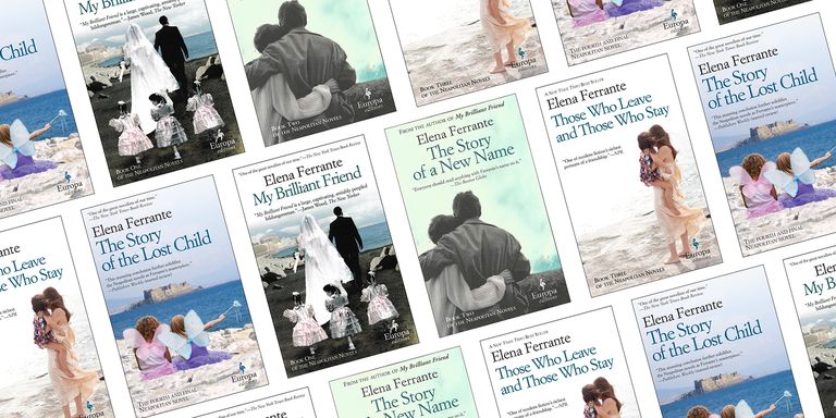
Among the other works of note they bring out, the one writer that I keep meaning to read from them happens to be Elena Ferrante. But somehow, other books keep getting in the queue. Ironically, somehow people seem to think that the Ferrante book covers are “hideous”, and “trashy”, and “evocative of a $4 romance book found at a gas station“. Chip Kidd apparently unloaded on them in a podcast, and you can read a critique and a breakdown of the design, followed by a redesign of the cover to My Beautiful Friend here. While I love the in-depth analysis on the site, I still think Ragnisco’s covers serve their purpose wonderfully.