It’s rare for me to buy books without having a solid reasoning framework built in my head. There are enough titles on my shelves, both analog and digital, to keep me entertained for the next century and a half. But I bought Muriel Barbery’s Elegance of the Hedgehog and Gourmet Rhapsody just because I liked how the books looked. It also helped that they were a dollar each, but mostly, I liked how they looked.
I read Hedgehog last month, and while I had reservations about parts of it, especially the ending, the book is just the right combination of bittersweet story and sugary pop philosophy. Some of the “deep” bits are a little too heavy on the cream and sugar, but it’s the focus on the characters that save the book from becoming a cloying souffle. Renee, the secretive autodidact who runs a building without revealing her love of Russian literature and Japanese film to the world at large, and seeks to lead a life of painful mediocrity because of a lifetime of class-based presumptions that come her way. And twelve-year old Paloma, a resident of the same building, who thinks the world does not contain anything that could surprise her, and whose plan for her next birthday involves suicide. The first part of the book shows us parallel lives that occupy the same geographic location but are worlds apart, and as the two find their lives intertwined, there are expectations subverted, and cliches adhered to, at the same time.
“I wanted to burn the book after the end :)”, my friend D texted me, when I told him I finished reading it. He’s French, and I just had to find out what he thought of it. I understood his reaction, kind of. It’s not the ending one expects, though the movie does a slightly better job of showing the ramifications. Oh, there is a movie, of course. I picked it up from the library even as I was running through the last few pages of the book.
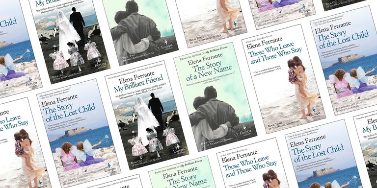
Now, back to the cover design. Europa Editions, the company that published this, is known for two things — their choice of great books around the world to translate into English, and their design aesthetic. All their books have French flaps, use the same title font (Garamond?), feature the Europa logo of a stork featured prominently on the bottom right, and they have the same size. This is really staggering consistency, considering that every writer/publisher combo out there seem to want their book to pop on the shelves with different heights and aesthetic. Europa’s look is intentional, however. Their books are all translations and span multiple genres, and the cover design is by a single designer, Emanuele Ragnisco. As Ragnisco mentions in a 2010 interview —
I approach each cover design as if it were a “small manifesto,” one whose goal is to communicate to the potential reader that this book contains something that concerns him directly. The second goal is to distinguish the cover in question from every other cover. We address the first question by individuating the most appropriate language. By “language” I mean the language of signs. In the choice of a particular sign, we posit our response to the first goal. The problem of making each cover stand out from others is more complicated. The solution lies in carefully studying what is currently out there. At certain times, color dominates jacket design, and so a cover that is pure white is likely to stand out. At other times, covers with an abundance of design particulars are predominant, and the intelligent choice in terms of visibility may be a simple, pure design.
The brand identity of these covers are unparalleled, my eyes can immediately locate a Europa book in the new arrivals section. Another interesting fact is the choice of the stork as emblem. The bird is known for a migratory pattern from east to west and then south, in Europe. The company began in Italy by publishing books from Eastern Europe, thereby mirroring the journey of their bird of choice.
Among the other works of note they bring out, the one writer that I keep meaning to read from them happens to be Elena Ferrante. But somehow, other books keep getting in the queue. Ironically, somehow people seem to think that the Ferrante book covers are “hideous”, and “trashy”, and “evocative of a $4 romance book found at a gas station“. Chip Kidd apparently unloaded on them in a podcast, and you can read a critique and a breakdown of the design, followed by a redesign of the cover to My Beautiful Friend here. While I love the in-depth analysis on the site, I still think Ragnisco’s covers serve their purpose wonderfully.
Every now and then, when it comes to buying stuff indulging in collectorial practices, the imaginary line I draw in the imaginary sand is smudged by an imaginary eraser. As a result of which the aforementioned line becomes the kind that would give Cecil Radcliffe a severe case of the runs, followed by the chills.
Case in point: offerings from Subterranean Press. I have whittled down my purchases to the barest necessary, but my resolve was tested earlier this month, when it was announced that Joe Hill’s latest collection of short stories, Full Throttle, would have a SubPress limited/signed release. Seeing as how my waffling over NOS4A2 did my blood pressure no good in the past, I knew I would go for it. But it took about a week of gritting my teeth and wringing my hands before I actually ventured to lay down $175 for the pleasure of owning a copy of the book, sight unseen, numbered and signed by Messrs Hill and McKean, he of Sandman renown. But the limiteds of 20th Century Ghosts and Heart-Shaped Box are biblionicorns of the kind that make hearts and wallets bleed, and I would rather not take a chance with a Hill book.
It also did not hurt that the Suntup Press limited edition of Hill’s Horns just came to Papa about 2 weeks ago, after a wait of about half a year. I confess to owning the PS Publishing signed/limited edition that came out in 2010, but Suntup’s version was too hard to pass on. The line in the sand that I drew for signed limited editions was that I would only buy one if the original author was among the signers, and Horns met the criteria, while Haunting of Hill House and Rosemary’s Baby did not. Not that I did not have severe crises of conscience, but the line held. It did not however hold for Cormac McCarthy’s The Road, one of my favorite works by the man. Suntup’s edition, not out yet, but sold out in pre-orders, has an introduction and an autograph by Joyce Carol Oates. McCarthy is notorious for not signing his books, specifically The Road, which he has apparently signed a few copies for his son alone.
What really rubbed the line this week was the announcement that Tamsyn Muir’s first book Gideon The Ninth would have a limited release via Subterranean, and copies would go on sale on Tuesday morning. Now here was the situation:
The only thing I knew about the book was the phrase “lesbian necromancers in space”
It wasn’t out yet, so I could not read it
Reviews had come in from a coterie of distinguished authors, including Warren Ellis, VE Schwab, Charles Stross, Robin Sloan, and Max Gladstone (whose This is How You Lose the Time War is what I am reading Right. Now)
I happened to get to the Tor website, which had a preview of the first chapter of the book. And by the time I got to the phrase “stupendous work of a titty nature”, I was sold.
Or rather, I was coerced into depositing 85$ for the pleasure of owning a copy of the book signed by the writer herself, courtesy of SubPress.
Which should make me feel terrible vis a vis the Great and Terrible Sullying of the line that guides my buying habits, but you know what?
The book fucking sold out in two days. Had I waited a day more to buy it, I would have been gnashing my teeth by now and breathing slow and deep trying to keep calm.
To make up for this psychological distress, here’s a bunch of pictures of the magnificent Joe Hill book from Suntup Press.
I probably would have never encountered Ocean Vuong had it not been for James Ellroy. Not in the way you think, though. Ellroy is the furthest one can place from Vuong when it comes to writing style or genre. But it was while attending an Ellroy signing one Saturday at Skylight books that the MC mentioned it may be prudent to buy a copy of writer Ocean Vuong’s book in advance, because it looked like the event would have to be capped.
If there is a single thing one picks up on in independent bookstores, much like in libraries, is that if a recommendation comes from a staff member or from a librarian, it’s best to not reason why, but jump right in. I bought a copy of “On Earth We are Briefly Gorgeous”, spent the weekend reading it, and then came back on Tuesday to listen to Vuong reading from and talking about the book, his first published novel.
It was, believe it or not, a very emotional experience. The crowd was packed, very diverse, the book obviously had a lot of fans even before its official release. I stood in the back of the store, barely able to see Vuong as he whisper-sang words from the book and from his heart. There were people crying during the question-and-answer session.
I don’t want to write about the book, or about Vuong and his life and work, since other people have already done it way better than I ever could have. What I do want to mention is that very obvious sentence. You must read this book. Because it is, true to the writer’s name, filled with joy and mystery and heartbreak and pulls you into its depths with a fierce, unrelenting tug, from the very first page. I have been reading a lot of immigrant fiction lately, tales of travelers to the shores of this country of contradictions. “On Earth We are Briefly Gorgeous” establishes itself as one of the best books about belonging and unbelonging that I have read in recent times.
Migration can be triggered by the angle of sunlight, indicating a change in season, temperature, plant life, and food supply. Female monarchs lay eggs along the route. Every history has more than one thread, each thread a story of division. The journey takes four thousand eight hundred and thirty miles, more than the length of this country. The monarchs that fly south will not make it back north. Each departure, then, is final. Only their children return; only the future revisits the past. What is a country but a borderless sentence, a life?
I won’t stay here long, we might say. I’ll get a real job soon. But more often than not, sometimes within months, even weeks, we will walk back into the shop, heads lowered, our manicure drills inside paper bags tucked under our arms, and ask for our jobs back. And often the owner, out of pity or understanding or both, will simply nod at an empty desk—for there is always an empty desk. Because no one stays long enough and someone is always just-gone. Because there are no salaries, health care, or contracts, the body being the only material to work with and work from. Having nothing, it becomes its own contract, a testimony of presence. We will do this for decades—until our lungs can no longer breathe without swelling, our livers hardening with chemicals—our joints brittle and inflamed from arthritis—stringing together a kind of life. A new immigrant, within two years, will come to know that the salon is, in the end, a place where dreams become the calcified knowledge of what it means to be awake in American bones—with or without citizenship—aching, toxic, and underpaid.
The weight of the average placenta is roughly one and a half pounds. A disposable organ where nutrients, hormones, and waste are passed between mother and fetus. In this way, the placenta is a kind of language—perhaps our first one, our true mother tongue.
One of the most powerful paragraphs of the book involves the presence of metaphors for conflict and violence in discussing art, and Vuong commented on the same during his question-and-answer session:
You killed that poem, we say. You’re a killer. You came in to that novel guns blazing. I am hammering this paragraph, I am banging them out, we say. I owned that workshop. I shut it down. I crushed them. We smashed the competition. I’m wrestling with the muse. The state, where people live, is a battleground state. The audience a target audience. “Good for you, man,” a man once said to me at a party, “you’re making a killing with poetry. You’re knockin’ ’em dead.”
So yeah, read it.
Also, if you are ever in Los Angeles, make sure to look at the Skylight Books events page beforehand, and try to visit one of their signings. The bookshop is in a beautiful LA neighborhood called Los Feliz, and you will feel like you have been there before and walked the streets. You won’t be wrong, because it is a favorite shooting location for TV shows and films alike; two I remember off the top of my head are Ruby Sparks and Atypical, and I am sure there are many more. The bookstore is named for its naturally-lit interior, and there is a tree in the center of shop that makes it even more spectacular.
Oh, and before I forget, James Ellroy’s signing was a hoot. He’s an incredible…character, someone who plays a version of himself in a crowd. Foul-mouthed, rambunctious, funny, and very very kind in person. A reread of the LA Quartet is on the backlog. Watch this space.
Actually, it has ended, for now. But not without a denouement of sorts, involving suspense, trepidation, and finally, joy.
So remember I talked about this publishing house called Dragon Unbound, which did these funky cast iron and asbestos covered rebindings of first edition Stephen King books? The owner is a gentleman named Paul Suntup, a collector and entrepreneur, who apparently had bigger ideas. One of these ideas was a different publishing house, one dedicated to producing the highest quality handcrafted items possible. I know, it’s sort of a vague commitment –– how exactly does one even measure that kind of quality anyway? The mission statement of the company is simple and profound.
(Our) books (are) created with care and grace by craftspeople such as letterpress printers, hand bookbinders, paper makers, typographers and artists, using some of the finest bookmaking materials…they are handbound, one at time, and we go to great expense to utilize only the finest materials available. Most of our editions are printed letterpress, which is the printing method perfected by Gutenberg, who used it to produce the first book printed from moveable type in the West, the now-famous Gutenberg Bible.
Suntup Editions began in 2017 by publishing an art portfolio of David Paladini’s illustrations to Eyes of the Dragon, a book written (obviously) by Stephen King and one that would have fallen squarely into the young adult category, had that term existed in 1984. It was written by King for children, his and his pal Peter Straub’s kids, to be precise. Paladini’s illustrations graced the mass-market paperback, and this was the first time they got their due. Suntup would go on to publish The Covers Collection, a set of high-quality prints of Stephen King book covers, done with the original artists’ blessing. That project is still ongoing.
But in the beginning of 2018, a video on the Suntup Editions website announced that they were going to release their first specialty book. The promise was bold –– 200 signed copies, out of which 185 would be for sale at $525 each, plus 26 lettered copies at a staggering $3950, and a small number of unsigned “gift” edition copies for a mere $110. Renowned artists Rick Berry and Dave Christensen were picked to contribute artwork –– Berry produced 8 paintings, and Christensen, known for the original 70s covers to Salem’s Lot and The Shining, did a set of black-and-white illustrations. The descriptions of the books bordered on pornographic.
The Limited Edition is a smyth-sewn quarter leather binding, with Japanese cloth front and back boards and a gold stamped spine. The edition is printed letterpress on Cranes Lettra Pearl White cotton paper, and housed in a custom clamshell box with a leather spine label.
The Lettered edition is limited to 26 copies for sale lettered A-Z, and is signed by Stephen King, Rick Berry and Dave Christensen. It is printed letterpress on moldmade Arches wove paper with a deckled fore edge, and handbound in full crimson goatskin leather. Endpapers are marbled, and made exclusively for this edition. The binding is sewn and rounded with a hollow back designed to prevent sagging fo the page block. The title is made using six original Royal glass typewriter keys which are inset into the cover, and the letter designation is a Royal key inset into the lower back cover. The book is housed in a custom walnut wood box designed to resemble an original royal Model 10 packing crate, and features a black velvet-lined book bed. The box is laser engraved and handcrafted by Dick Olson at his workshop in Farmington, new Mexico.
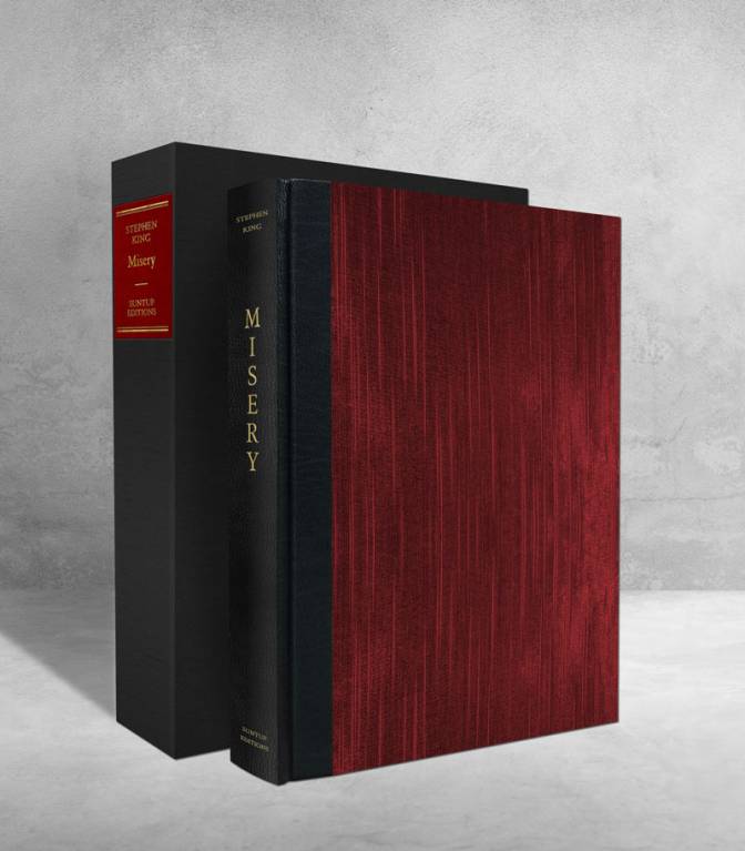
The book that Suntup chose to inaugurate this ambitious project was, in a word, perfect. After all, what Number One Fan can resist the siren song of Misery?
Annie Wilkes by Rick Berry
Collector forums went haywire. I was following the Dark Tower boards, and there was no doubt that people were about to throw the contents of their wallets at the altar of Suntup. I was one of them, obviously. Except I had a sinking feeling that I would be severely disappointed by the proceedings. Years of experience dealing with Mondo poster drops had deadened me to the devastating pain of adding an item to a shopping cart and clicking on check-out, only to see the message “the item is no longer available”. Add to it the fact that not all the limiteds were going to be on sale, a chunk of them were made available to customers who had bought the portfolio and prints from Suntup before. The lettered editions were already snapped up. Things were looking bleak, but I was going to try, no question about it.
I woke early the day of the drop. Did everything with an eye on the clock –– I have had experiences when I missed a drop because I was distracted at the last minute. Created my account, logged in to said account, made sure I was logged into Paypal. Alarms were set to 15 minutes, 5 minutes, and 30 seconds to the release time. The sale was to go live at 8 AM on a Monday morning, and the next few minutes would decide if my week would be in tatters, or if I would be walking on air the next few days.
As soon as the buttons became active, my fingers flew on the keyboard. My stomach fluttered. There was a roar in my ears. Even as I clicked “add to cart”, I hit refresh on the backup laptop to make sure at least one of the orders would go through. Browser pages faded to white and status bars inched to completion. Teeth gritted, fingers clenched, I waited for a server crash, or a browser freeze. When “Order complete” message came up, the part of me still hopped up on adrenaline refused to believe in reality. I held my breath and waited for the actual email confirmation to come in. On the second laptop, I hit refresh on the main product screen. It was three minutes past eight, and the limited edition was sold out.
The email came in. I sighed. I remember laughing, and feeling light-headed and jelly-kneed. That whole week, I made for delightful company at work and beyond. It felt like a good start to 2018, a happy foundation for the whole year ahead. Reading the comments on the DT forum after the sale was over also made me realize just how lucky I had been.
Exactly six months later, on August 13, the package landed. Between February and then, I saw one copy of the limited edition (not the lettered) sell for $4000 via public auction, sight unseen. Since I was in Los Angeles, and the company is located in Irvine, I was one of the first recipients of the packages. It’s probably the only item for which I have created an unboxing video. Some day, when I am ready, the video will be put up online. Call me stupid, but holding that book in my hands felt like a quasi-religious experience. It was the first Stephen King book I bought via the primary market. That had to mean something, right?
The Fourth Book
Misery, Suntup Editions
Epilogue
Where do we go from here, how do we carry on
Will I continue to buy more of the King collectibles? Honestly, I do not know. Sometimes I feel like there is a part of me that wants to say “enough”. Comic art takes a lot out of me, and a huge part of my interaction with my primary hobby is to draw imaginary lines in the sand that dictate what I will go after next. It’s easy to give in to the frisson of excitement that follows a ninja purchase, but that is not what I crave any more. I have a handle on the art collecting bug, for sure. But there are enough Stephen King limited editions that make my palms itch, still. The limited edition of The Stand, for example, is bound in goatskin and comes in a wooden “coffin” box, wrapped in glassine paper. The Cycle of the Werewolf comes with a pencil sketch by Bernie Wrightson. And of course, finding a matching set of the Dark Tower Signed Limited books requires a matchless combination of single-minded determination, deep pockets, luck, and the right connections.
My absolute favorite King collectible is for a book that I never even finished reading, and one that does not figure on a top 20-list of his titles. It’s the lettered edition of The Regulators. Here’s the description (emphasis mine):
Hand sewn, hand bound in brown Morocco leather and Winchester 30 caliber bullets. The spine has the title and author’s name blind stamped wet to look like it was branded. The end leaves are of hand made and colored paste paper. The book is housed in a hand made faux-ammunition box covered in wood veneer with gold stamping on the side.
Yeah, the book has real fucking bullets embedded into the cover. But even more interesting are the signatures. Regulators is written by Richard Bachman, King’s pseudonym, and is a “dead man”. So to keep the story straight, the book came with dummy checks signed by the writer, which meant Stephen King signed as Bachman. Each check was made out to familiar names –– #A was to Carrie White ($125, prom dress), #I was to Roland ($50, a six-shooter), and #Q was to Pennywise Party Entertainment($100, balloons). A delightfully kooky presentation, and I have only seen it come for sale once in the last three years.
I know, I know, a third post on the same topic seems like a momentous occasion. My previous attempts to serialize any thematic content have crashed and flamed –– search for ‘Lone Wolf and Cub’, as an example. But this will be the last post on Stephen King collectibles, I swear. At least for now.
The Third Book
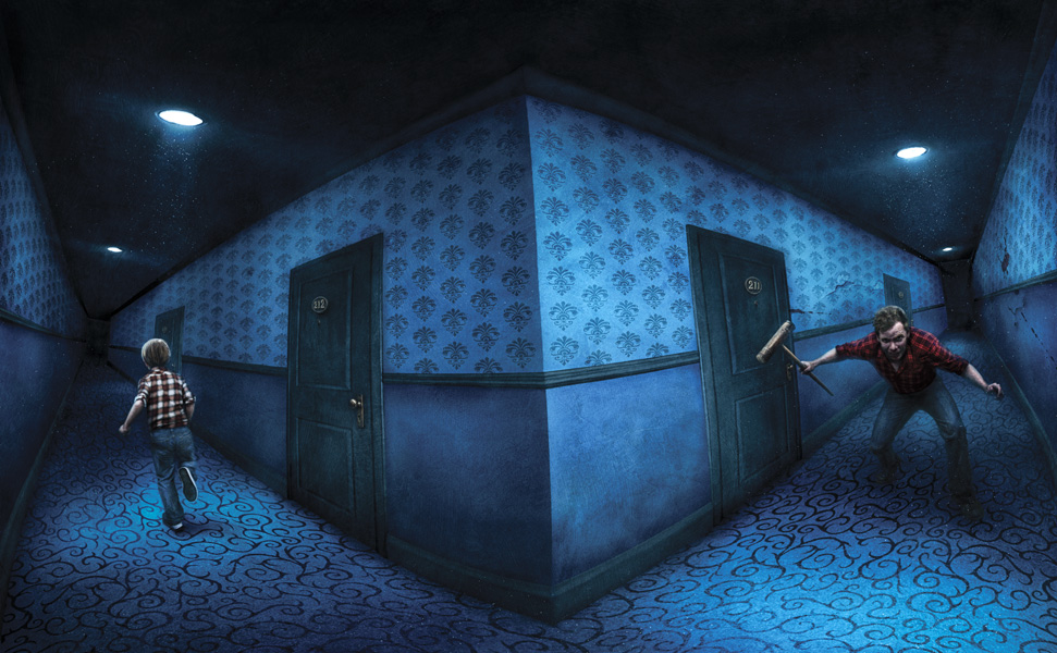
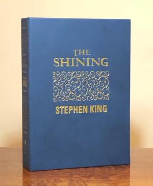
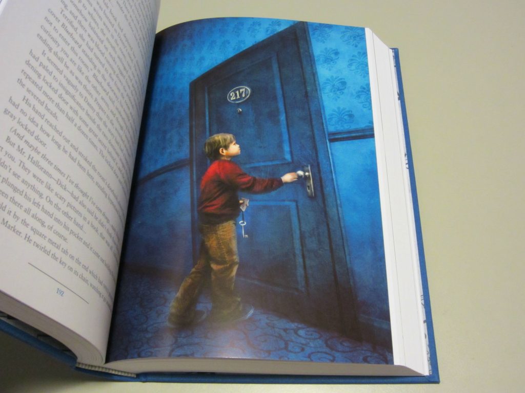
The Shining, Subterranean Press
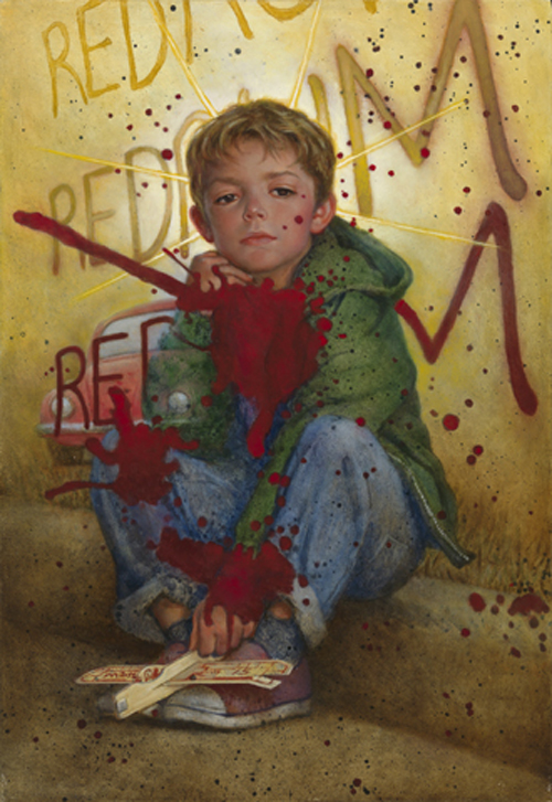
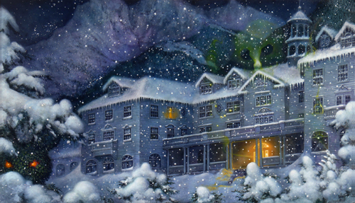
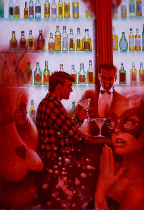
Illustration by Vincent Cheong
I believe I have talked about The Shining and all that it led to at least seven times on the blog, so no more of that. Once I began my journey into SK collectible territory, there was no doubt this book had to be part of the collection. But this is where reality and the intricacies of the market come into play.
The limited signed edition was published by Subterranean Press, a Michigan-based specialty press that I have talked about in the past. This edition came with a bit of controversy before and during its publication. The original illustrator (Gabriel Rodriguez, of Locke and Key fame) was replaced by Vincent Chong. Early copies shipped out to buyers had significant issues such as rubbing, spotting, and color transfer problems. The publisher had to issue a dust jacket and send it out to buyers, along with a gift card for a future purchase and replacement tray-cases for copies that had the color transfer issue. (Details here)
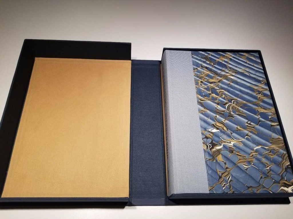
Subterranean Press’s The Shining
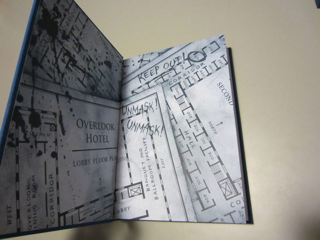
The Subterranean limited release has 750 copies, signed by King and Chong. The book and the tray-case are beautiful, high-quality deckle-edged paper and print quality. The cover is minimalist, with beautiful patterns on a background of blue. Chong’s illustrations pop out on the color pages, and there was even an accompanying sketchbook that contained preliminary pencil pieces.
But the lack of any extra material is a disappointment. No preface, no afterword, no essay, or deleted material. What really got my goat is that as part of the Doubleday Years reprints that a different publishing house, Cemetery Dance was bringing out, this book got a different, unsigned deluxe release, one that was more desirable than the SubPress version. Why? An email from CD explains:
We have some AMAZING news to share. As you know, Stephen King has graciously allowed us to restore his long lost, 40 page prologue called “Before the Play” to the beginning of the book. It has never appeared in any edition of THE SHINING anywhere in the world and may never be reprinted again. In the weeks since the book sold out, something even more incredible has happened. A collector named Jon Page contacted us because he had something very special in his collection: an earlier draft of the manuscript, when it was still called THE SHINE, which had been sent around to Hollywood production studios to sell the movie rights before the book was published. This manuscript includes HUNDREDS of sentences, paragraphs, and even scenes not included in the final book we all know and love. Of particular interest is a four page section toward the end known as “After the Play,” which even Stephen King believed had been lost forever because he didn’t have a copy in his archives. Thanks to Jon’s amazing discovery, and Steve’s generous permission, all of this Deleted Material will now be included as Bonus Section in our special edition of THE SHINING, which you already have on order. You do not need to do anything to confirm you are receiving this material, it will be in every copy of our edition. Adding this material will take about two weeks of additional production time, but it means this version of the book will be as definitive as possible, which should make it an even bigger hit with collectors for years to come. A HUGE “thank you” goes out to Jon and Steve for making this addition to the book possible.
This was in addition to a foreword by King, and an afterword by Mick Garris, the director of the TV adaptation of the book. The TV miniseries, by the way, was King’s attempt to outdo Kubrick’s version, which he hated. The Cemetery Dance edition was also illustrated by Don Maitz and Glenn Chadbourne, and all in all, looked just as fancy as the SubPress edition. Except, like I said, it was unsigned. Well, there was an ‘Artist Edition’ signed by the illustrators, but no King signature.
Don Maitz illustrations
So this is where one needs to make hard choices –– what truly is a ‘definitive’ version? Is it the author’s endorsement? Or is it something that contains all paraphernalia associated with a work? The heart says the former, the head the latter. I did end up buying the Subterranean Press version on eBay. Even got a limited UK edition of Doctor Sleep to go with it, signed by Stephen King with only 200 copies published. But oft in the gentle night, ere slumber’s chains have bound me, I find myself looking at Cemetery Dance listings on eBay. To sum it all up in a thousand words: