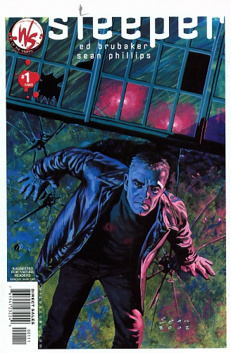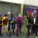
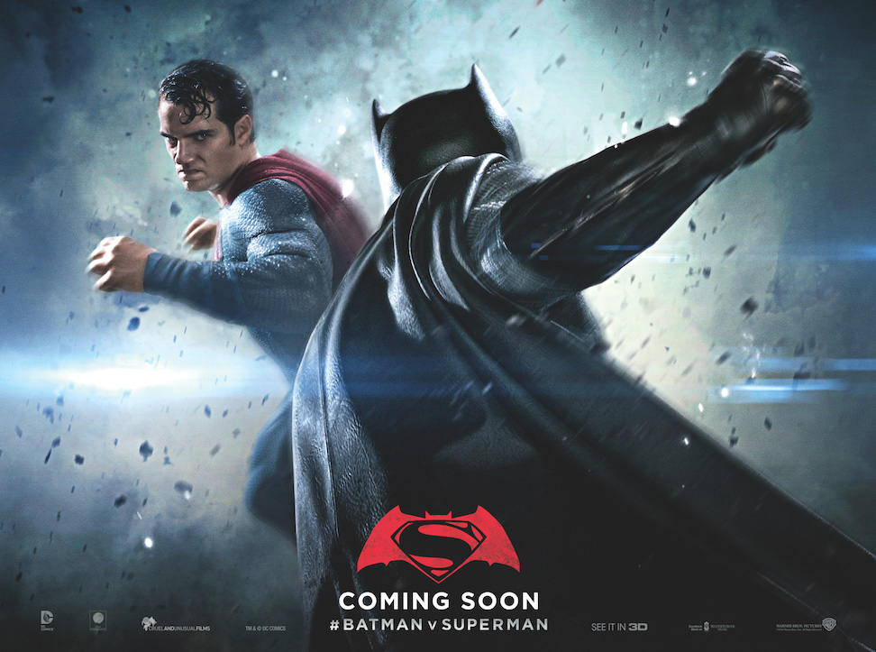
Batman vs Superman is out this week, and here are a couple of disorganized thoughts on the State of the Superhero.
I dislike Batman. It’s funny that I should say that about a fictional character, especially one that has brought me such joy while growing up. You guys are well aware of how much I have been into the character, and there is this element of hypocrisy that looms large over a statement like this one. But I have problems with the character, and more specifically, what has become of the the storytelling engine behind Batman.
History Lesson
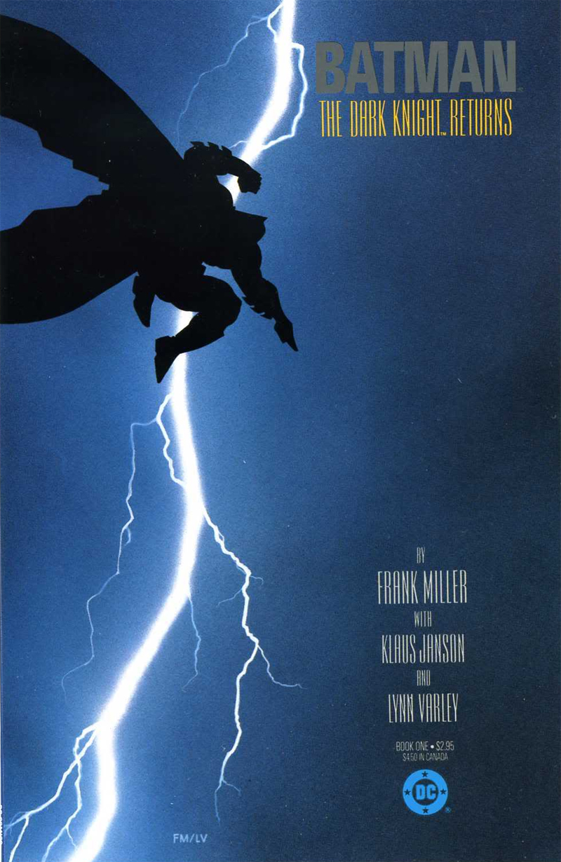
This lineage of Batman “troubled man who dresses up to exorcise his demons” obviously begins with Frank Miller’s Dark Knight Returns and Year One in the mid-1980s. But these books were one of a kind — DKR was an interpretation, not a definition of who Batman was — and it took a long time before Miller’s rage-and-angst-fueled ingredients seeped into the character’s engines. You had the pure joy of Mike Barr and Alan Davis’s short run, which ran in tandem with Year One, funnily enough; Alan Grant and Norm Breyfogle’s vulnerable yet foreboding Batman; Doug Moench and Kelly Jones’ surreal Goth-meets-art deco incarnation; even the group-think endeavors like Knightfall and Prodigal and No Man’s Land, the messy products of their time that they were: all of these retained some amount of humanity that made you like the character likable, even relate to him, maybe, because Batman always did the right thing. But yes, elements of Miller’s work were creeping in slowly — Jason Todd, Robin #2 died at the Joker’s hands, something that Dark Knight Returns had alluded to. Making that book prescient almost made it seem like that dark future was in store for Batman, but we weren’t there yet.
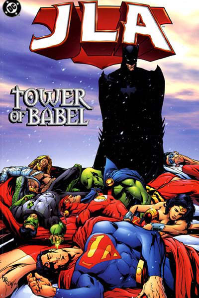
It was Grant Morrison who is to blame, when you think about it. Morrison, fresh from a career of revamping DC’s fringe characters such as Animal Man and Doom Patrol, found himself in charge of the Justice League of America in the late 90s. The JLA had their share of troubled history in that decade – editorial diktats mandated the use of second-tier characters in the team because the Big Guys were involved in soap operas of their own[ref]Superman died, and came back again. Batman had his spine broken, and then it was healed. Wonder Woman was replaced, and then she came back. Green Lantern went crazy, and another Green Lantern took his place. [/ref]. Morrison insisted on using the main characters, and among the changes he made to the JLA status quo, the major one was this:
Batman, despite having no superpowers, was the most dangerous man alive.
Batman has it all covered.
He can take down anybody. He is the embodiment of human perfection. He has a contingency plan for everything — seriously, everything. If the universe was about to be destroyed, Batman could pull a universe-undestroying glove from his utility belt and punch the universe into being whole again.
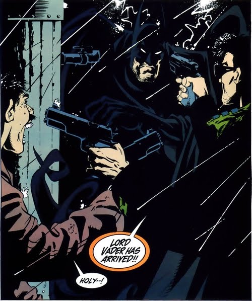
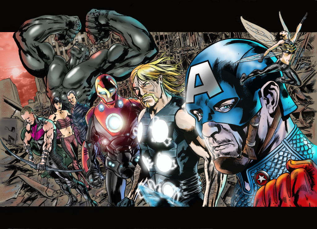
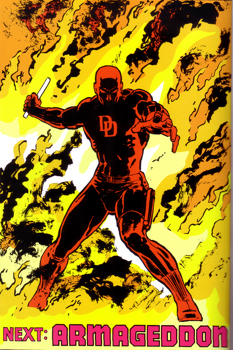
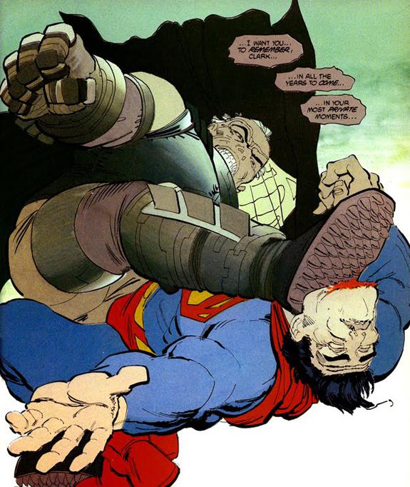
This particular concept found much favor among fans, myself included. Unfortunately, when combined with the climactic scene of Miller’s seminal work, people — writers, fans, the ecosystem at large — began to extrapolate the facts in a very strange way. What was a one-off sequence involving careful planning and execution suddenly became a trope in itself. Batman can beat Superman anytime, they said. There was a proliferation of stories where indeed, Batman was not only rescuing the JLA from problems that stymied all of them, he was also beating Superman almost on a yearly basis. Miller’s 2001 sequel, The Dark Knight Strikes Again, begins with a showdown where Batman, now even older, drops a pile of rocks on an angry Kal-El, punches him with a pair of special gloves and says “Get out of my cave”. In Jeph Loeb and Jim Lee’s Hush, in Scott Snyder and Greg Capullo’s newest incarnation of the Batman, in tales of alternate realities and stray one-shots, the message remains the same: Batman can take Superman. Any time.

And all of that brings us to Batfleck taking on hairline-receding Superman on the screen.
End History Lesson
At the heart of it all, along with his seeming ability to go toe-to-toe against super-humans, Batman is still Bruce Wayne, a middle-aged rich guy who uses his money to dress up and go out and punch criminals. He says “My City” without a trace of irony. He is always right. He is rude and insensitive to people around him, and over the years, this assholish behavior has been amped up to stupendous levels. He will be part of a team, but everything and everybody has to play by his rules. He has an extended family, recruiting a bunch of boys and girls, men and women as part of his war on crime, but he also insists on being a loner, incapable of having a normal human relationship with anyone around him. His intensity has been stretched to such an incredulous length that Batman the character has become a self-parody. Batman is a scary reminder of what happens when Big Money meets Mental Illness meets Misguided Intentions meets Non-scalable Implementation.Somehow, “Batman does not kill” has become an excuse to make the character as unlikable and smarmy as possible. [ref]Donald Drumpf however sounds more like a Marvel alias, right?[/ref]
But wait, you say, isn’t punching criminals the focal point of every superhero story?
Yes, you are right. At the end of the day, superhero stories are still about grown men — and women — punching each other into submission. But hey, it has been 75 years since we have had a man putting on a suit and heading out late at night to deal with the trauma of his parents being killed in front of his eyes. You could say that problem with Batman is emblematic of my problems with superhero stories in general. To be more precise, the mainstream superhero scene, these characters that have plodded through decades of reinvention, retelling and occasional resurgence. With a character like Batman, there can only be an attempt to retell the story with a fresh angle, to rearrange the familiar pieces and give them weight depending on which pieces we are focused on. Every now and then, someone figures it’s a great idea to add another piece[ref]The character of Hush is an attempt, as is the Court of Owls.[/ref] but all it does is add chaos to an already teetering structure. Add to it the fact that DC/Marvel comics, since the 80s, have been stuck in this confusing identity crisis (pun intended) where they are unsure about whether they are a children’s medium or aimed at adults. You point out flaws in the machine, and they want you to take a deep breath and lighten up, because superheroes are for kids. At the same time, the themes they handle try to be mature, the Comics Code Authority was thrown out the door a long time ago, and any attempt at wholesomeness stopped when anal rape became a plot point 10 years ago.[ref]For those who do not know, Identity Crisis.[/ref]
There are of course attempts to upend the structure every now and then: by what is referred to as a reboot. Scott Snyder, who I mentioned above, is the writer working on the new Batman. It is the first time in years that the origin story has attempted to break free of the long shadow cast by Year One. Snyder calls his version Year Zero, and rather than the shadows and grime that Miller brought into his version, Year Zero has psychedelic colors and an out-there, sci-fi vibe to it that I dug quite a bit. But the 75-year old legacy cannot help but creep into the pieces that a creator adds to this new structure, and it takes very little time for the building to collapse yet again. By the time the Joker is added to the mix, in a story called ‘Death of the Family’, we have — deep breath — the Joker in Arkham Asylum with a villain called the Dollmaker “who surgically removes Joker’s face at his request and then pins it to Joker’s cell wall as a sign of his rebirth”. By the time the Joker shows up again, in “Endgame”, he has become a scientist who has come up with a new chemical isotope (called, er, ‘Ha’), and the story also “implies that he is immortal, having existed for centuries, and has developed a means to regenerate from mortal injuries…(the story also) restores the Joker’s face, and also reveals that he knows Batman’s secret identity”. Umm, okay.
Add to it the fact that Batman’s story never does have an ending. [ref]Frank Miller wrote The Dark Knight Returns as the last Batman story, and that went on to get its sequel 15 years later, and there is a third part out now. Neil Gaiman wrote a story called ‘Whatever Happened to the Caped Crusader’, which was Gaiman interpreting every supporting character in Batman as erudite people that knew exactly the right thing to say, just like bad fan-fiction. [/ref] He has gone from being a lone vigilante killing people as he sees fit, to a good guy working with the law, to someone who is an urban legend. Look at the origin story: Where once it was Joe Chill and Lew Moxon, one retelling made Ra’s Al Ghul serve as a catalyst; in another, it was a person named Jack Napier; yet another has the Court of Owls. What I am getting at is that: the entire enterprise of keeping a superhero’s motivations and methods relevant in our world seems to be an effort that sucks in writers and makes them spew out fan-fiction that grates against my expectations and knowledge as a rational reader. More so in terms of Batman, because writers tend to latch onto their inner anger, that part of them that wishes that they could respond to the world around them by dressing up at night and getting out to break a couple of jaws and kneecaps. [ref]Not to kill anyone, of course, because Batman does not kill. But it’s perfectly fine to break a wrist and maybe an elbow too, if a guy just pointed a gun at you, or flashed a knife, or maybe a crowbar. Hmm, maybe if he even looked wrong at you, or cut you in line, or honked at your car when you were merging into his lane.[/ref]And the worst part of it all? Nothing changes. Bruce Wayne will always go out at night and beat criminals up. Maybe he will disappear for a while, maybe there will be a new costume, maybe an unknown adversary of the past will suddenly come back in his life and upend Everything That You have Ever Known. The common storytelling engine to all superhero tales seems to be a treadmill: a tiresome, frustrating journey that goes nowhere and yet tires you out.
It therefore becomes easy for me to say that Batman — or superheroes, in general — are not for me any more. Which is a valid point, but goes against my innate approach to popular culture, which is that New is always good, and that creators in any field are getting better at what they do because they learn from the past, and can pick and choose elements that work wonderfully, and discard the things that do not make sense. But it is a problem when the past weighs so heavily on your appreciation of any future work; when in order to explain who a character is, you have to go read Wikipedia. It’s a shame when to explain or make sense of what is going on, you have to suspend your reading to understand that what you are reading may or may not be a part of the story; and that there was a story and it’s not valid any more, and what you are reading can be replaced by a completely different story.
If you are not convinced, and are framing your apologist fanboy arguments about why Batman is awesome, here’s a question for you: how many Robins have there been? What happened to them? Let me get my popcorn while you scramble for the answer.